CBS | Paramount + – FYC Campaign Identity

For Your Viewing
Paramount+ offers a captivating array of content, ranging from popular series such as 1923, Halo, 1883, Tulsa King, Yellow Jackets, and many others. With the anticipation of award season building up, Paramount+ recognized the need for a stunning graphics toolkit to effectively promote their shows for consideration. We are delighted to have the opportunity to once again collaborate with Paramount+ and assist them in creating this remarkable toolkit, tailored for both digital and print marketing endeavors.

Category Is: Premium
Our main goal was to create a sleek graphics toolkit that was versatile and captured the essence of Paramount+. In our creative process, we incorporated key elements such as the recognizable mountain peak and the iconic star halo, instantly resonating with audiences' nostalgia.
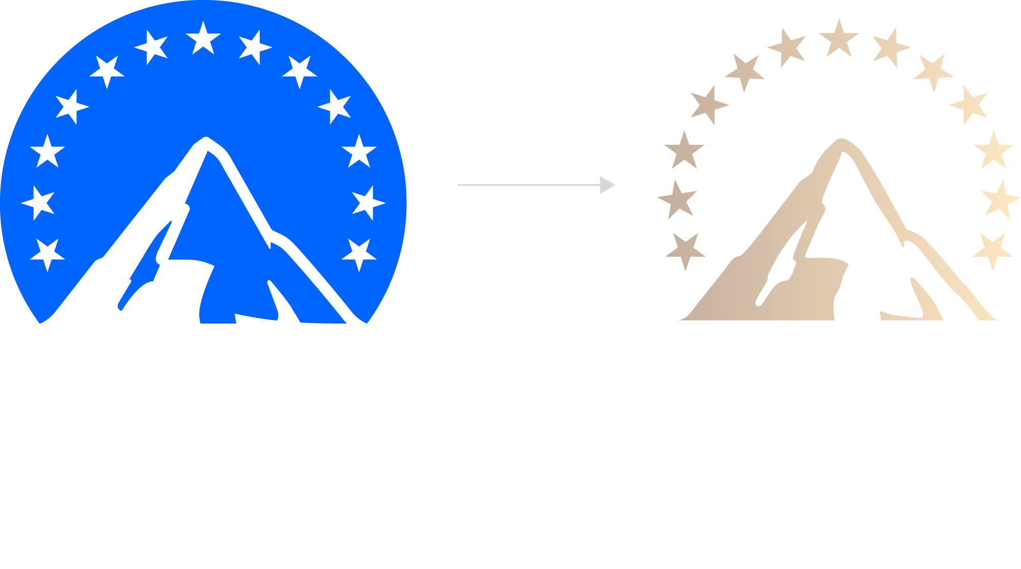
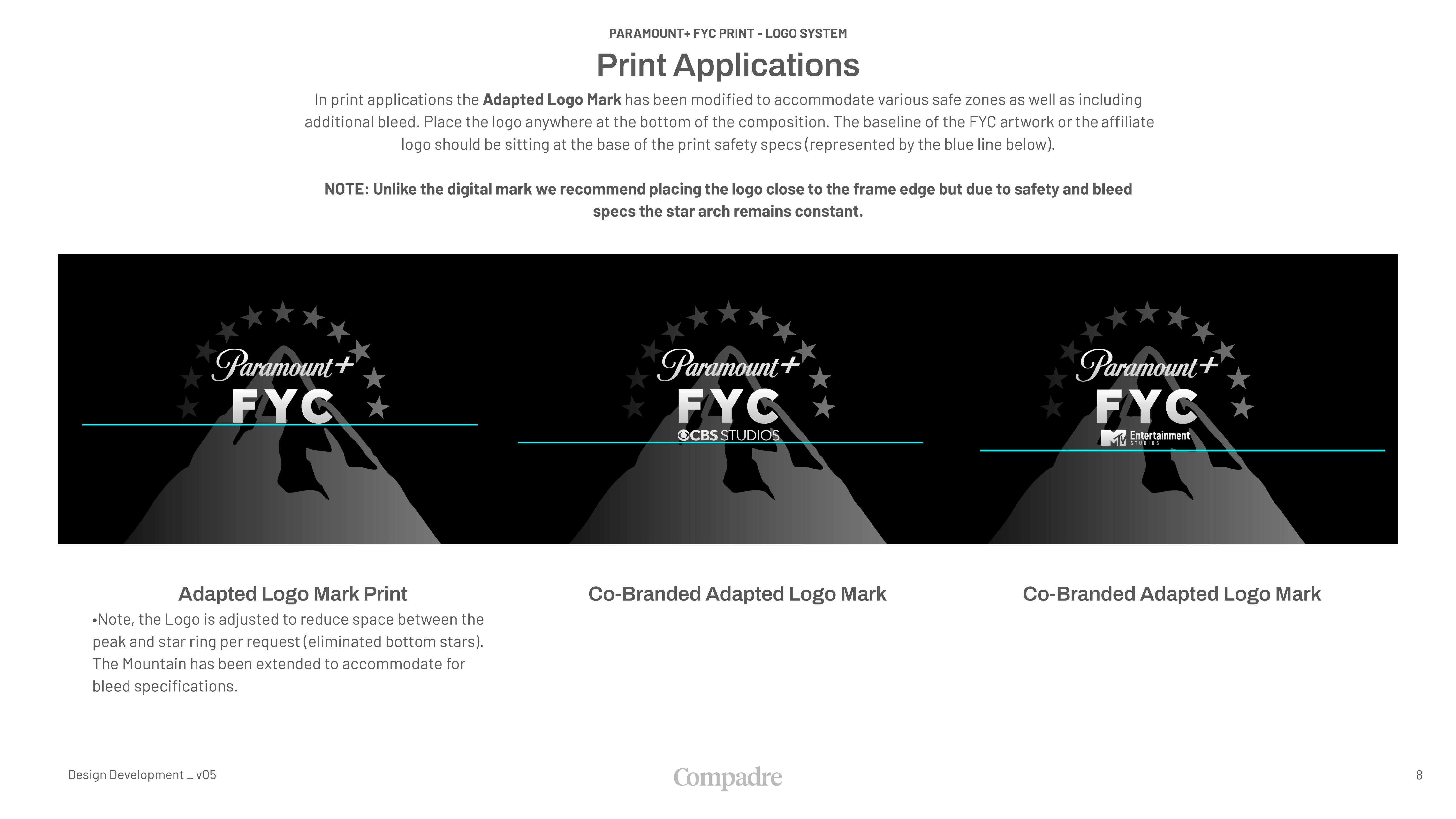
To elevate the overall aesthetic and add a sense of luxury, we elected two colors: a striking gold hue and a metallic-textured silver shade. These choices ensured a premium look and feel that harmonized seamlessly with the brand's image.

Ready For All Platforms
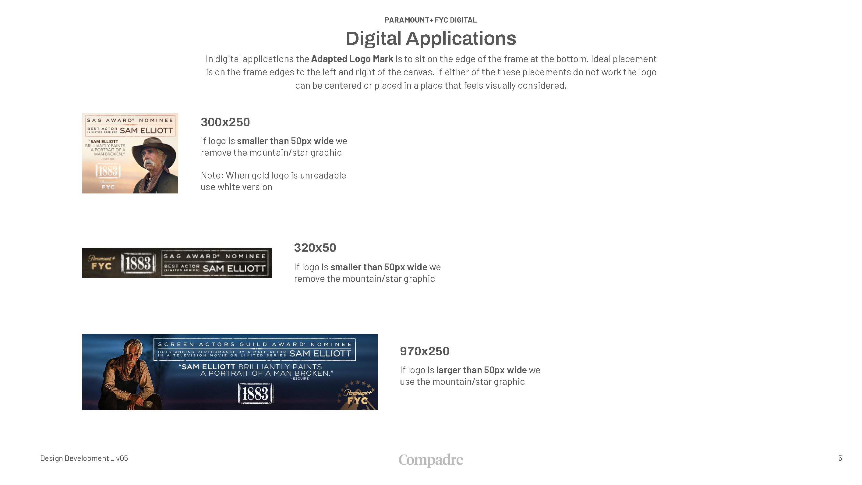
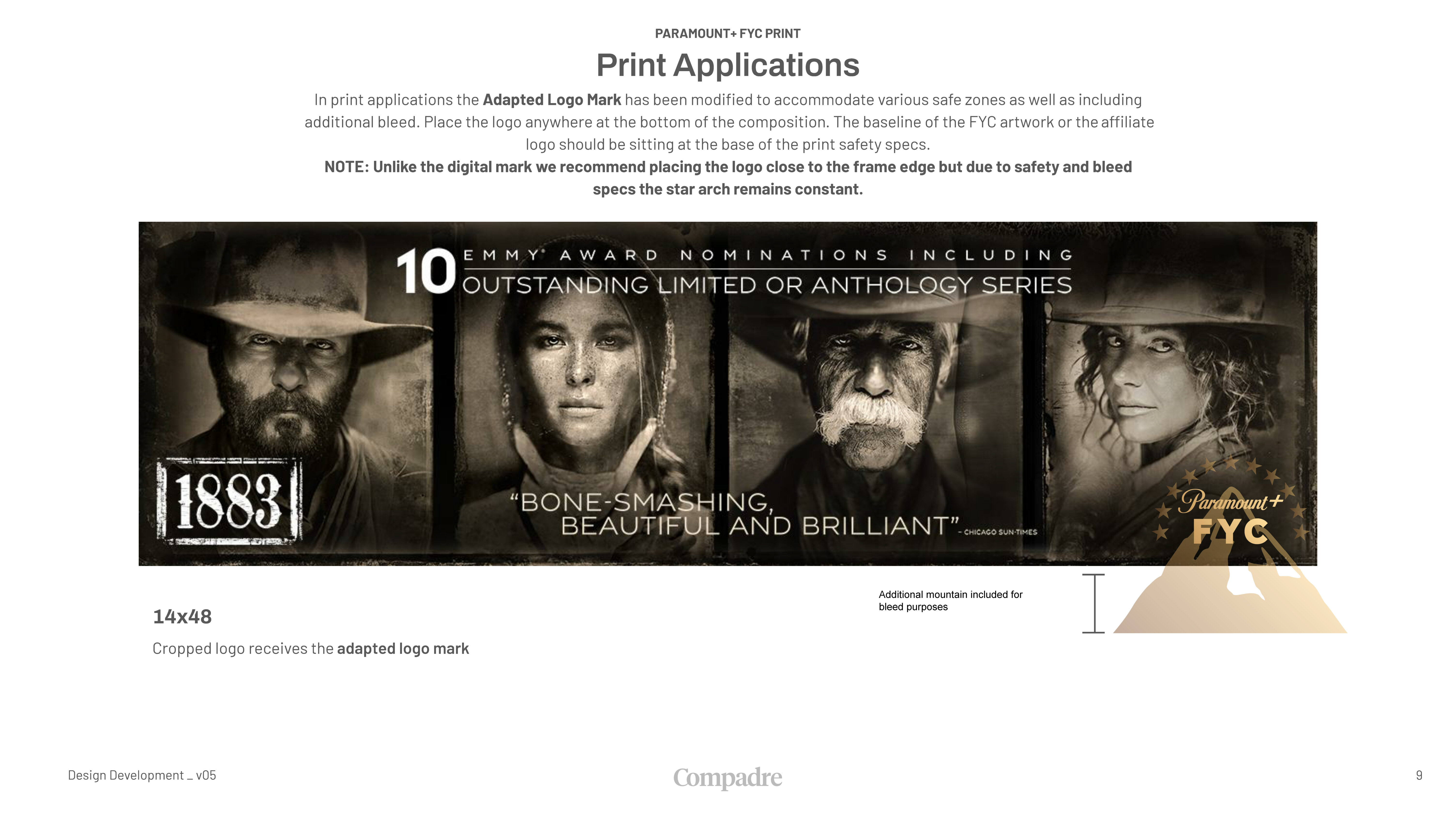
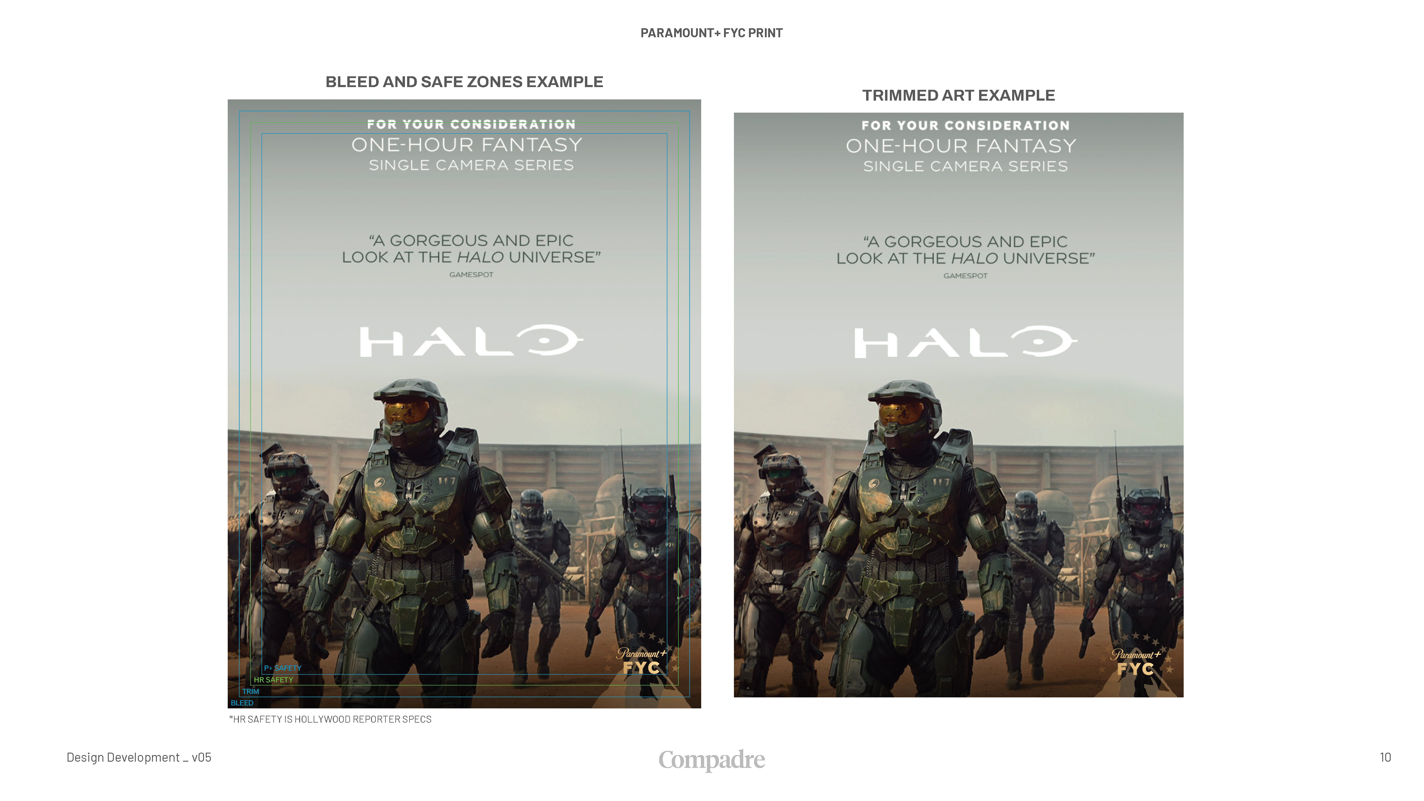
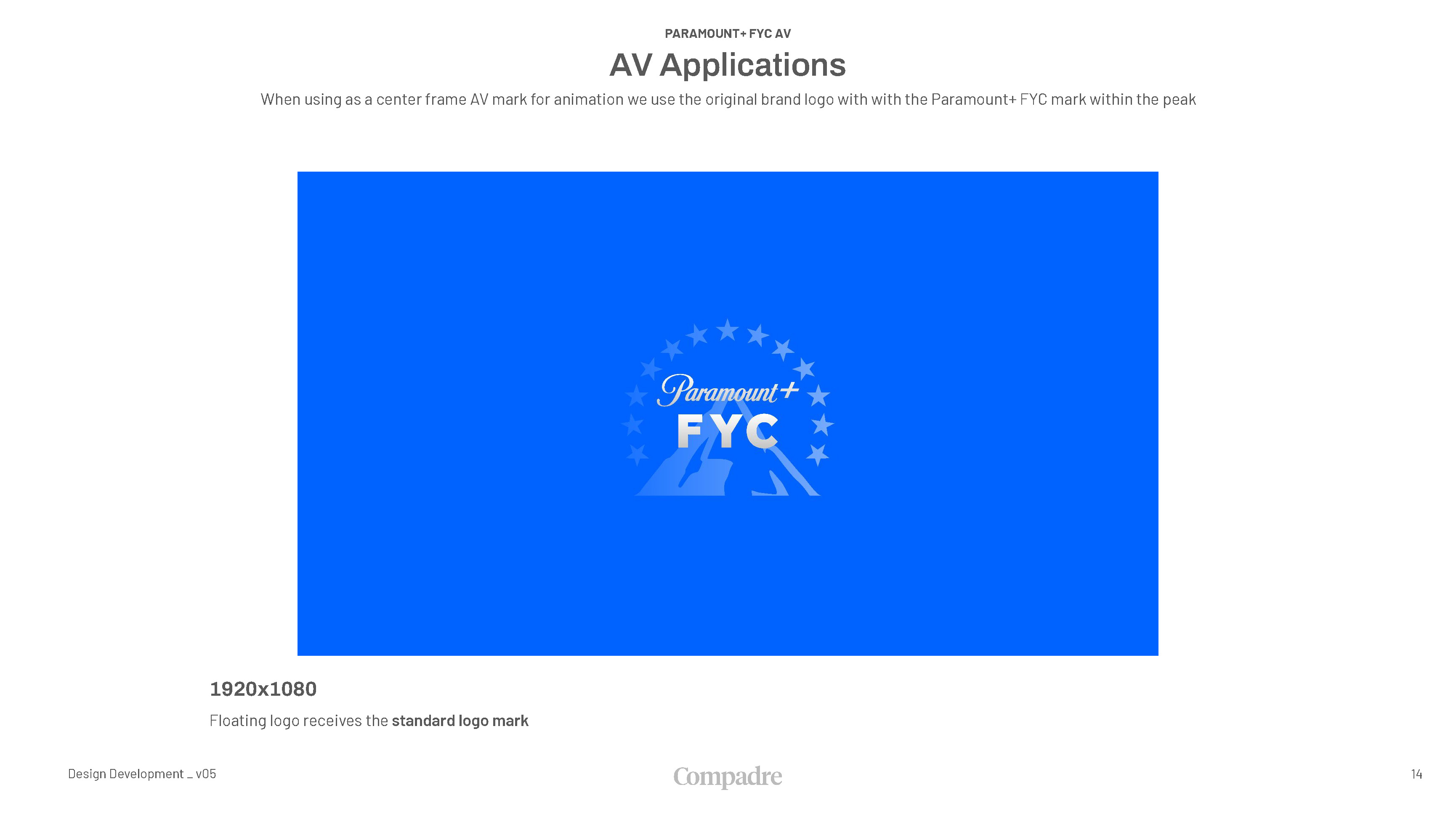
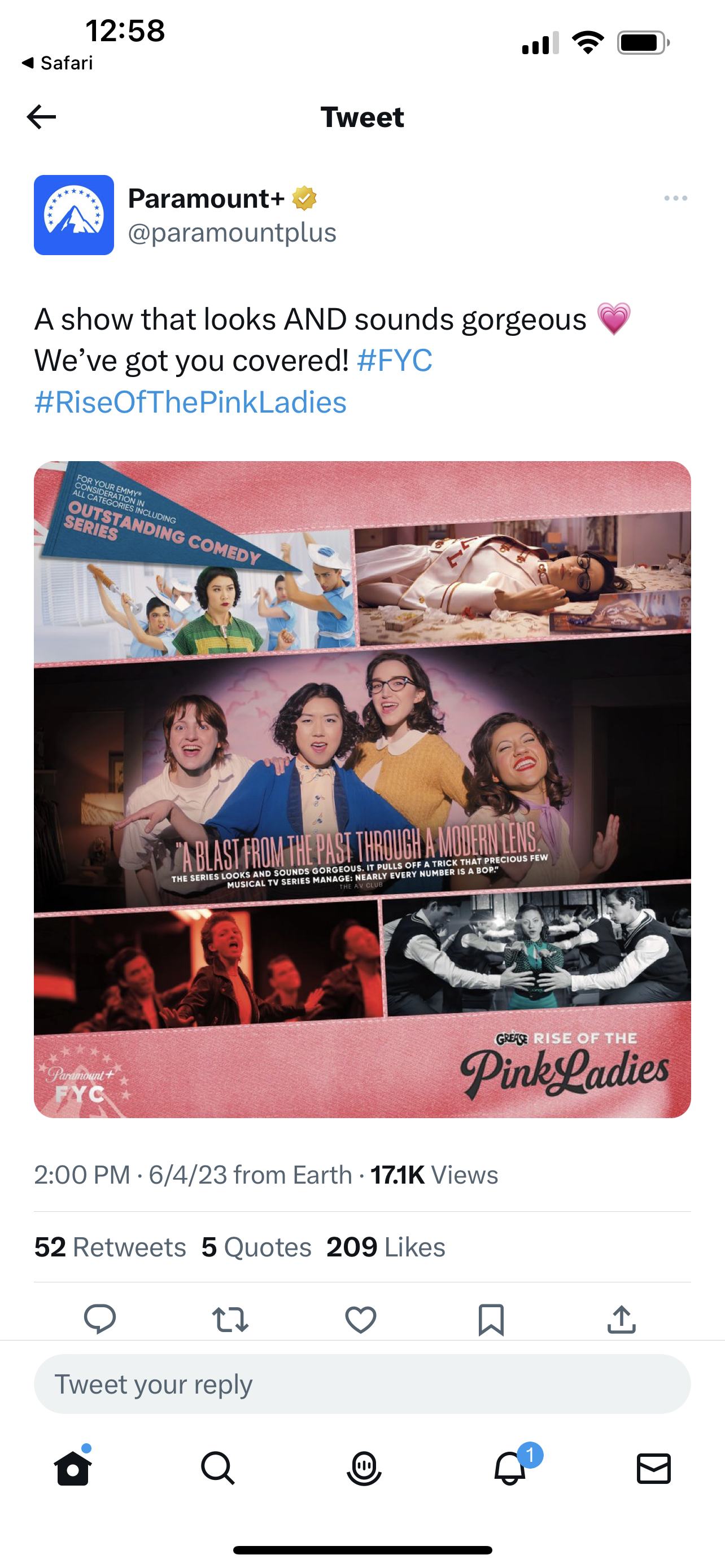
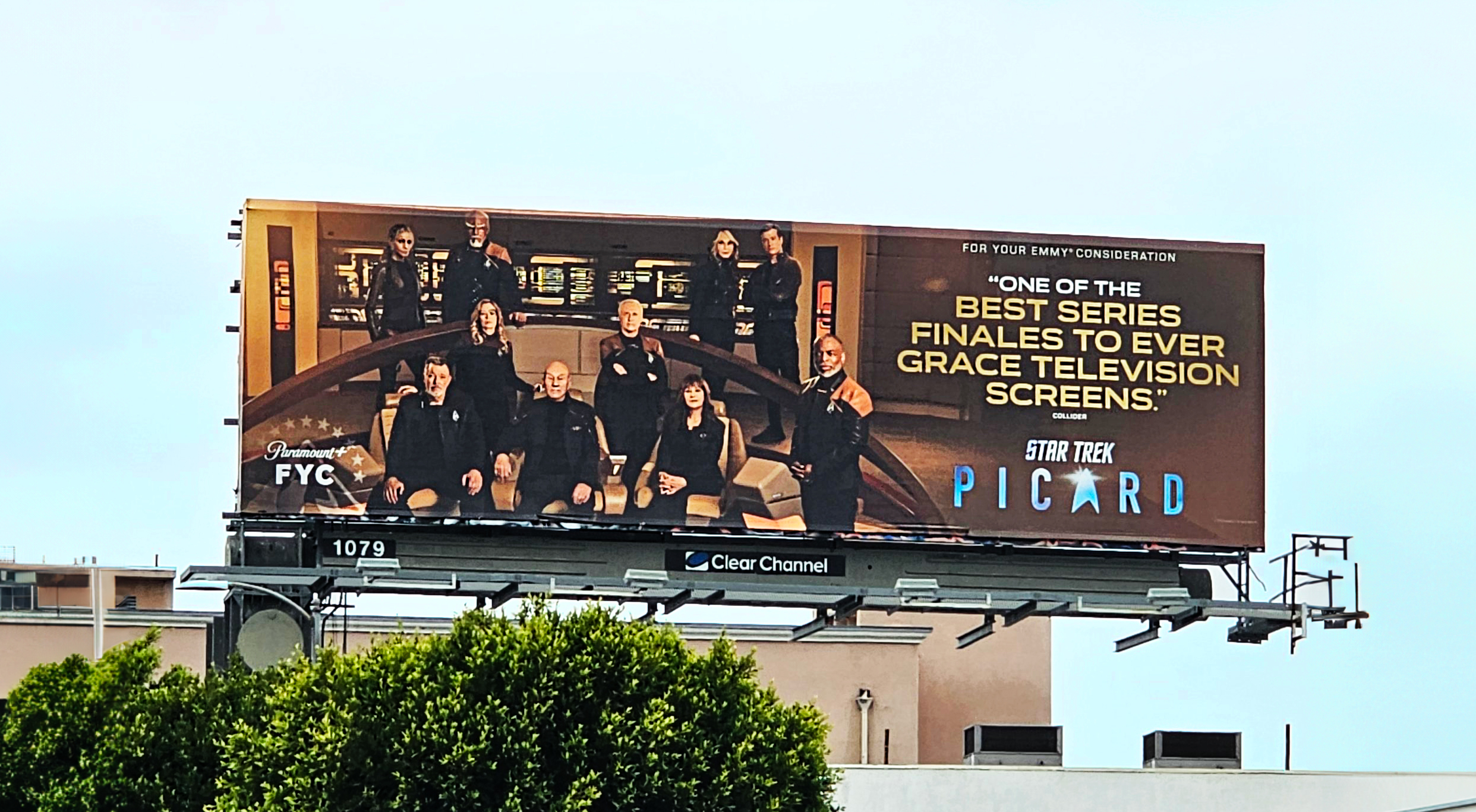
The flexibility of the Paramount+ FYC logo system shines through in its adaptability across different applications. Our toolkit offers a guide for logo placement, ensuring the smooth integration of the FYC artwork across any marketing platform. The flexibility allows Paramount+ to represent its brand across all formats while maintaining a harmonious and clean look.
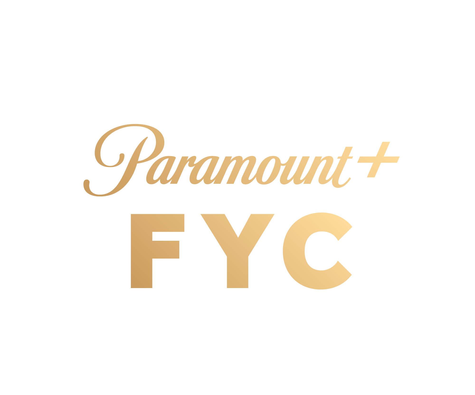
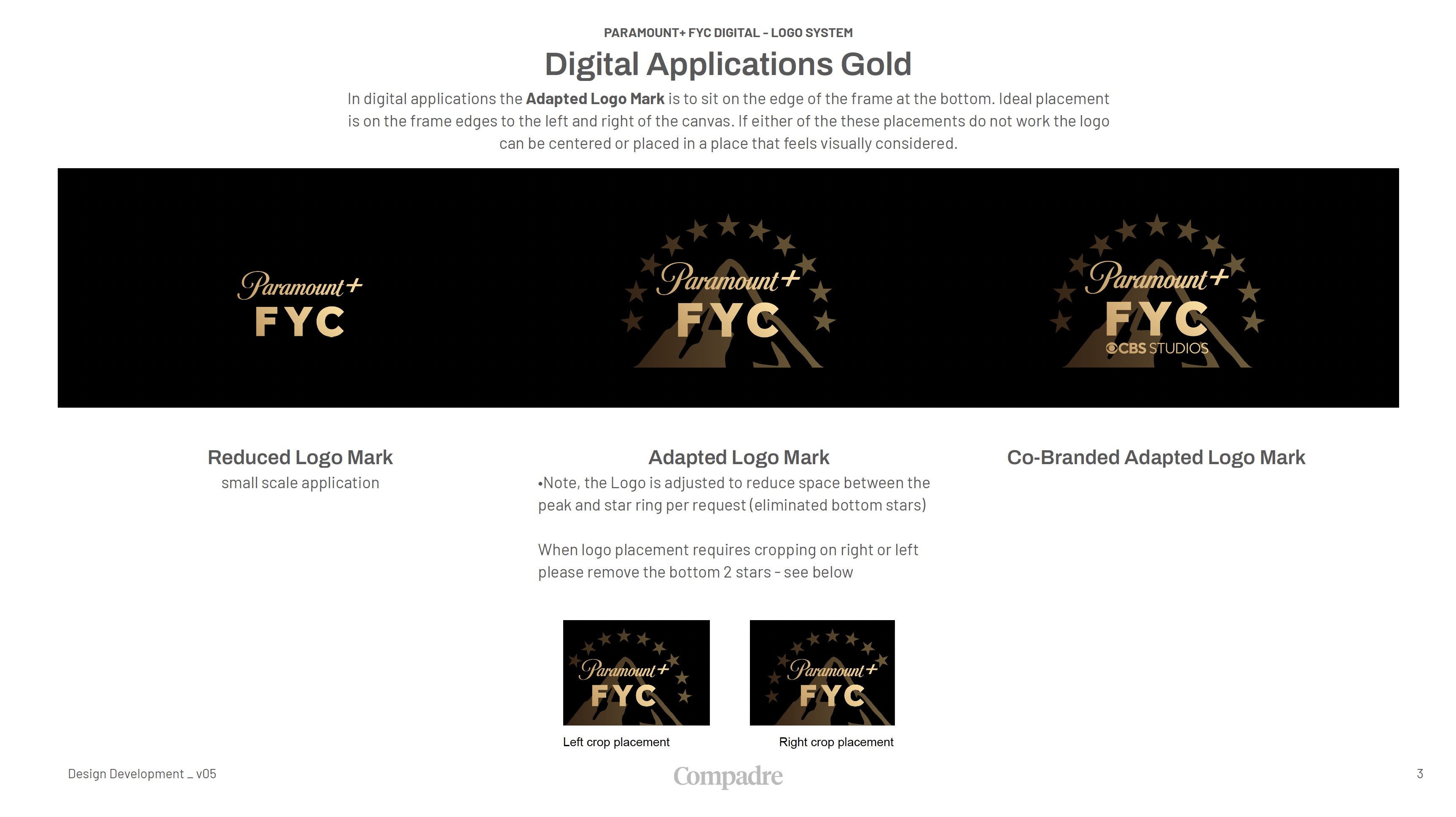
Reduced Logo Mark
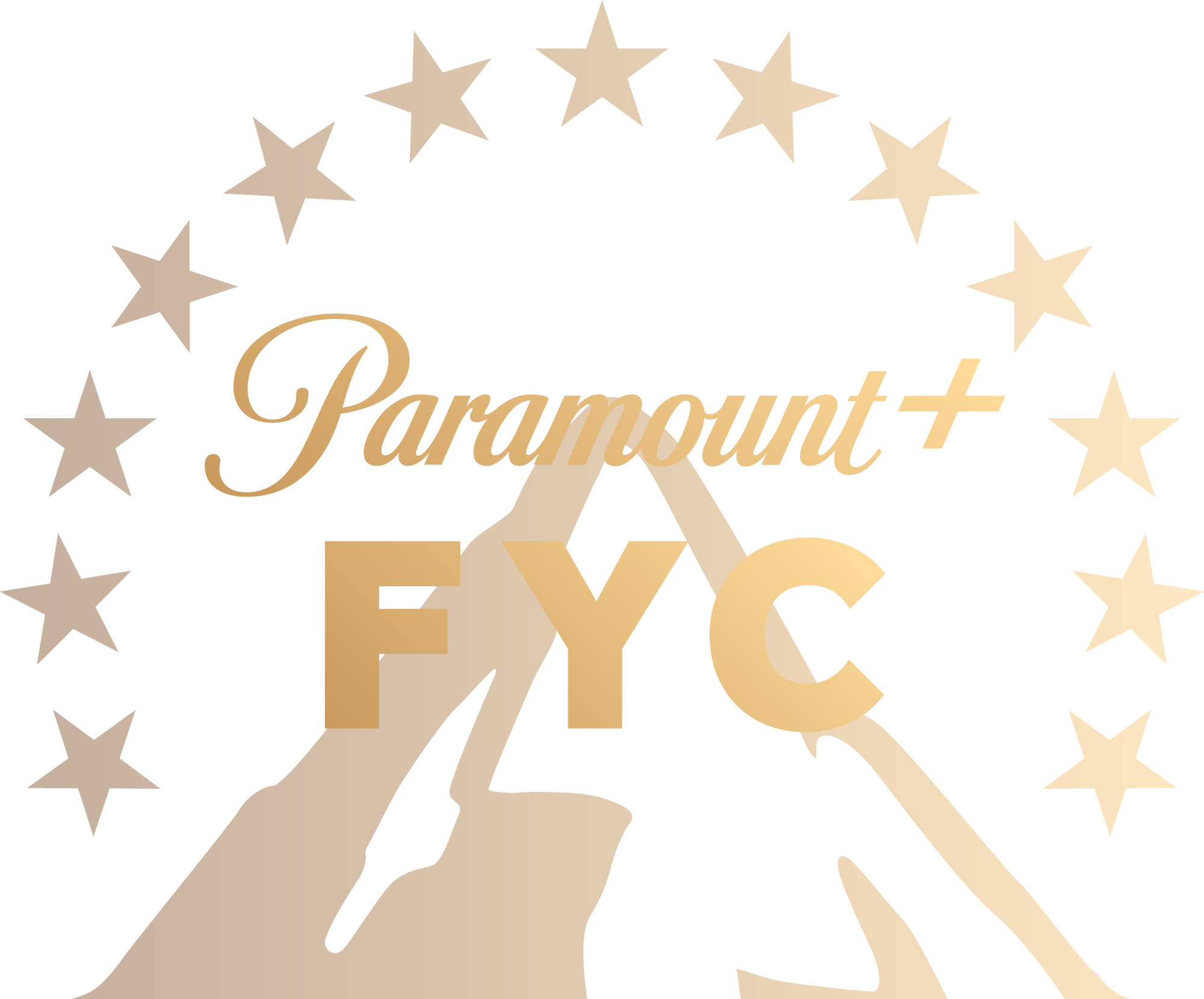
Logo Mark
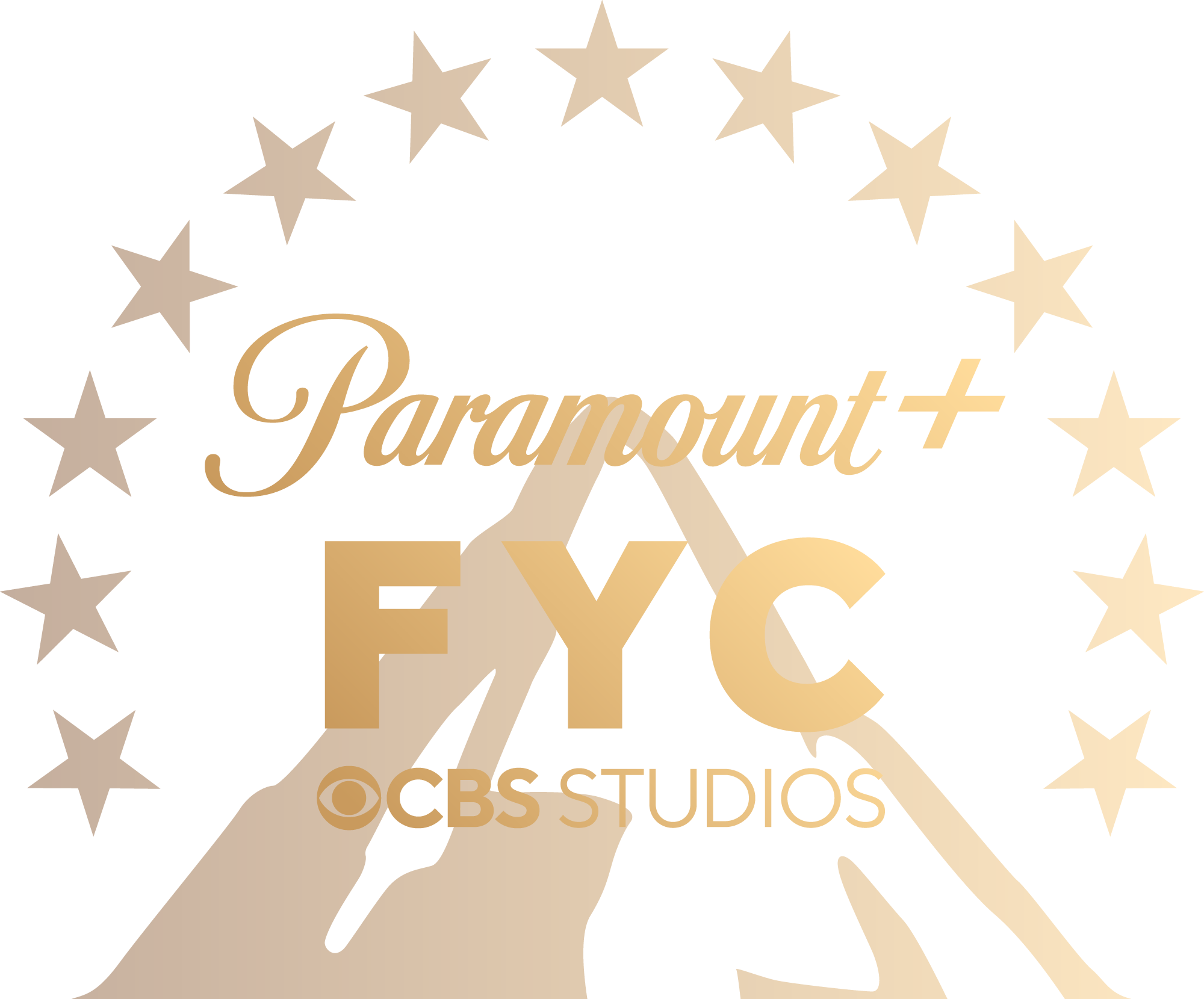
Co-Branded Logo Mark
Crafting Consistency
In addition to creating the graphics toolkit, we also developed a style guide to ensure effective and consistent use of the logos we designed for Paramount+. This style guide serves as a reference for placement and implementation of the logos across various platforms and mediums. With the style guide, Paramount+ can maintain cohesive visual identity to reinforce brand recognition and create unity in all marketing materials.




Stay in touch with your compadres
