ESPN – Around the Wicket Show Identity & Package Design

We created  a complete brand identity, including a dynamic logo, captivating air package, and vibrant set designs for ESPN’s latest show, ‘Around The Wicket,’ tailored specifically for the Australian audience.
Back

Welcome to The Crease

We created  a complete brand identity, including a dynamic logo, captivating air package, and vibrant set designs for ESPN's latest show, 'Around The Wicket,' tailored specifically for the Australian audience. Our mission? To captivate a diverse range of cricket enthusiasts, whether seasoned fans or newcomers, with an engaging and energetic approach.

Collage Full of Ideas

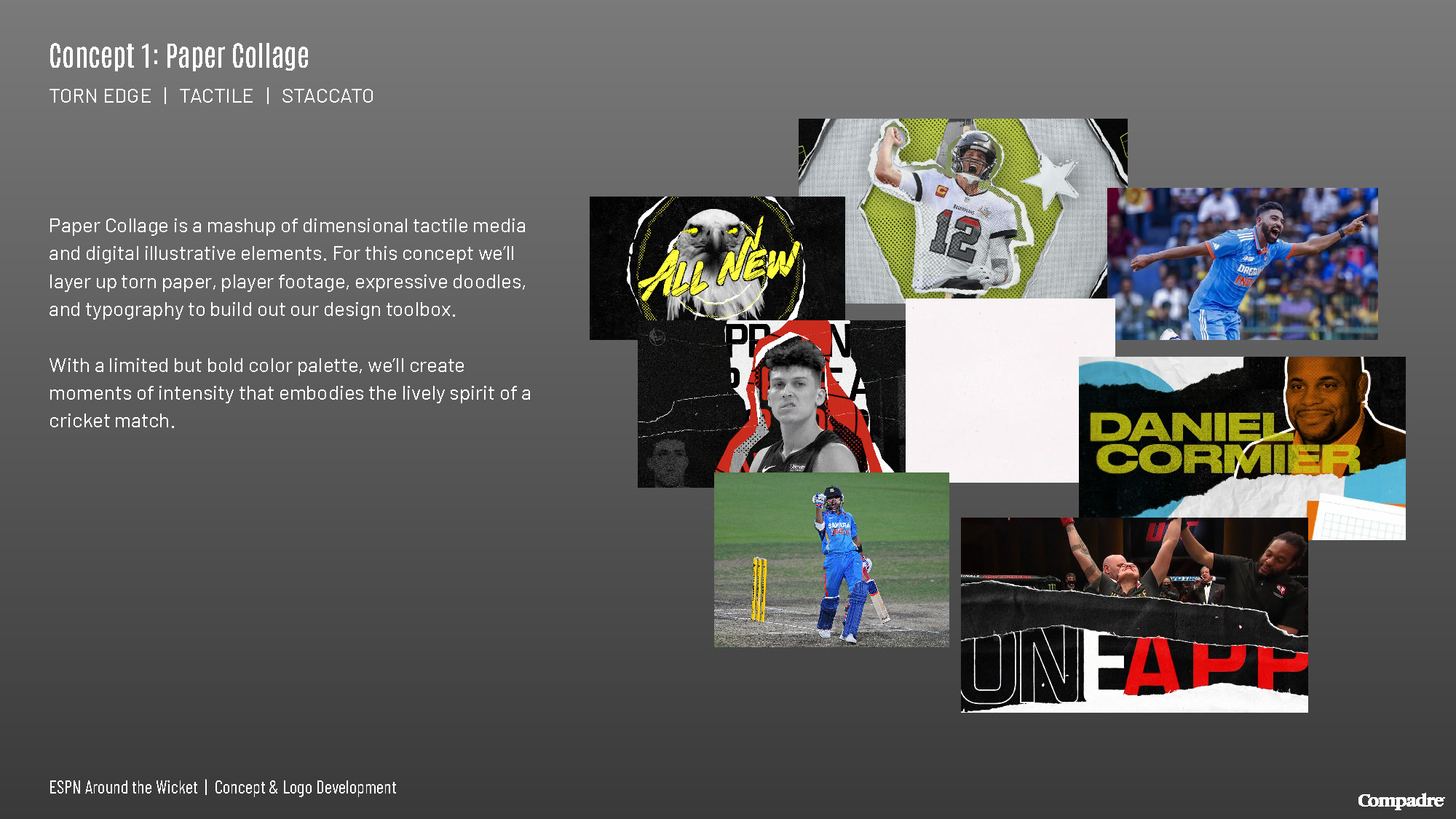
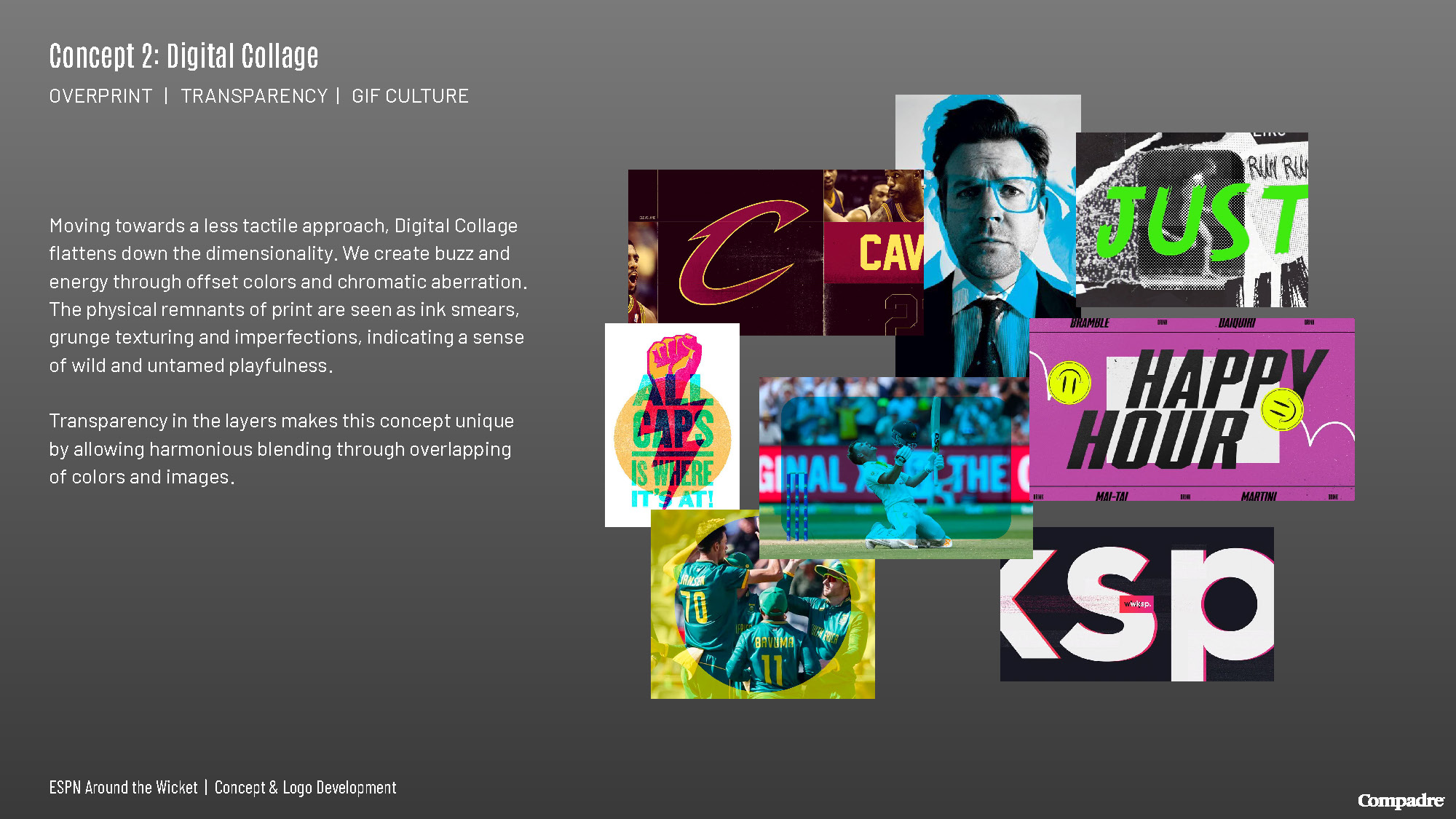
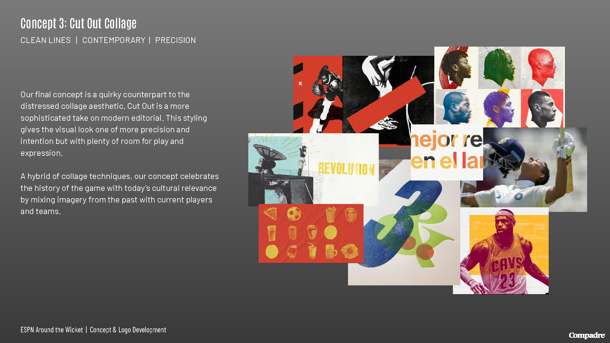
With client expressing that they liked the look of physical, paper, ink, and tearing, we explored three dynamic collage approaches that gave new life to the graphics.

The Logo

The logo picked was inspired by the bold over printing of colors. We made the logo in both light and dark versions and flexible to be stacked or on 1 line.

A Cricket Show Like No Other

Our graphics are made to elevate the show above the rest of the cricket-dominated lineup. With dynamic movement and typography across the screen, viewers are captivated the entire time.

A Full Package

We created all elements of the show, from  the smooth transitions and impactful bumps. Additionally, we designed their on-screen graphics including player stats, topic bars and video boxes.

A Set Like No Other

We also designed all the graphics to seamlessly transition on screen during the live broadcast.

Social Buzz

Social was buzzing as people expressed their excitement for this new show!

Stay in touch with your compadres