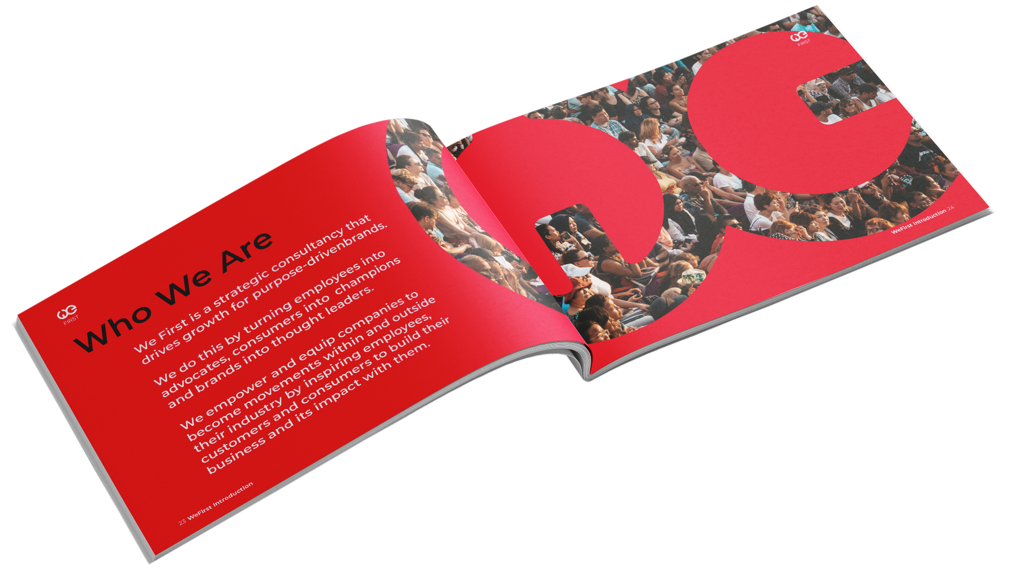
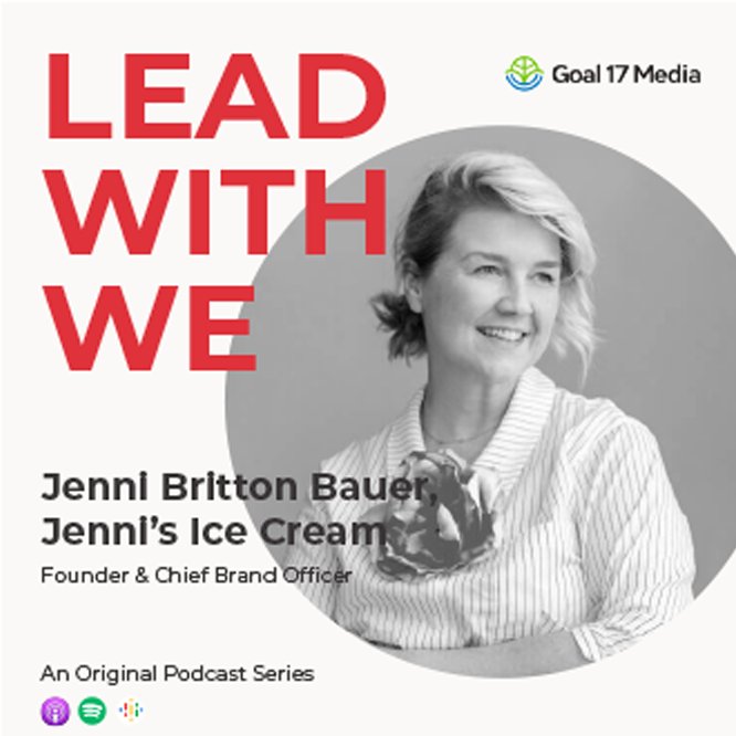
Our friends at We First have a mission we can get behind: building purpose-driven brands. From Toms to Coca-Cola to Sony, they’ve partnered with some of the most recognizable companies in the world to help them build businesses that are a force for good. So when they needed a refreshed identity, we were happy to lend a helping hand.
IDENTITY
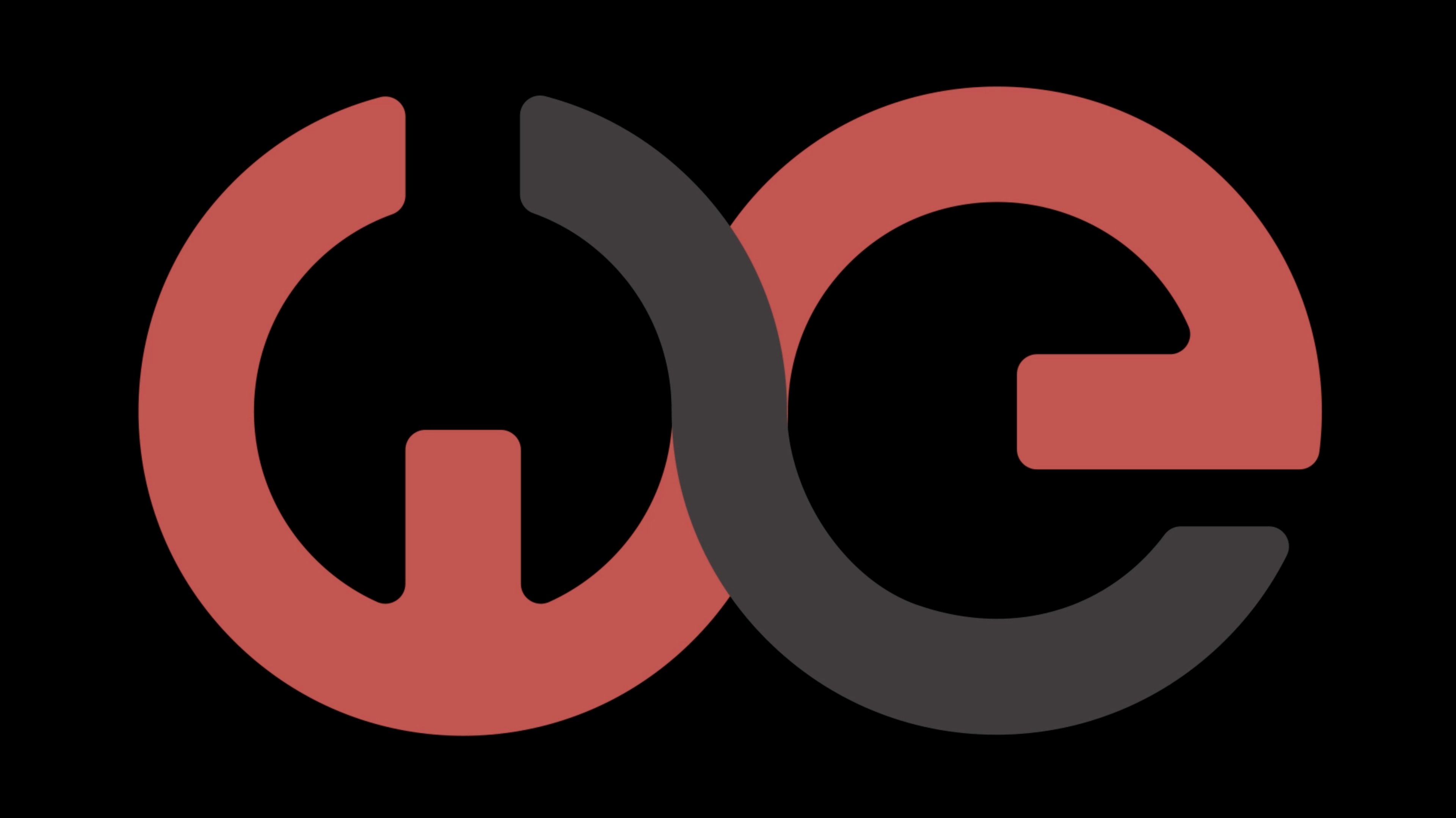
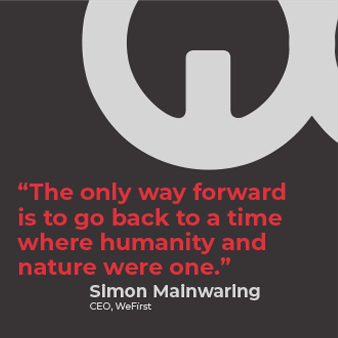
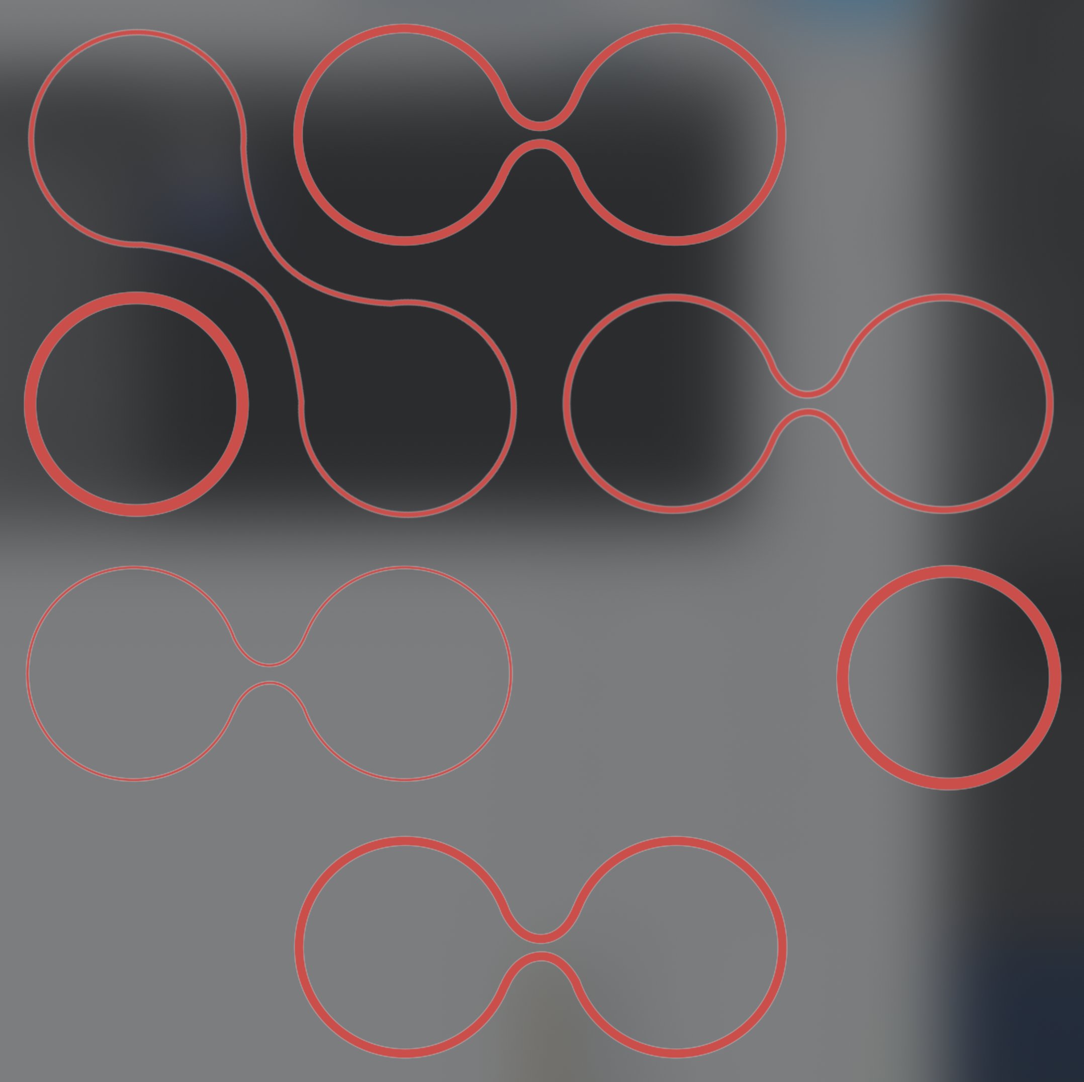
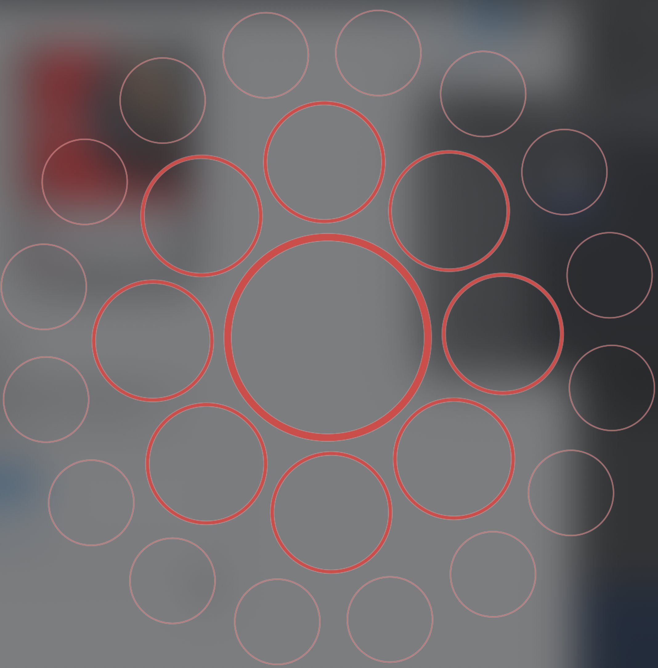
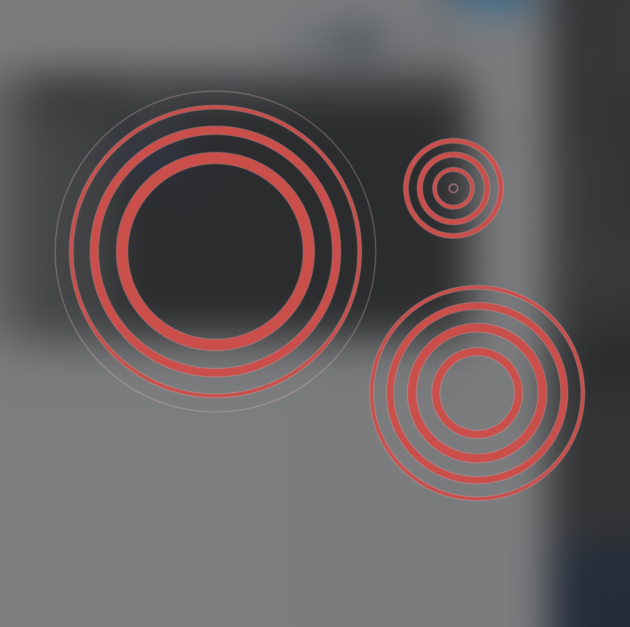
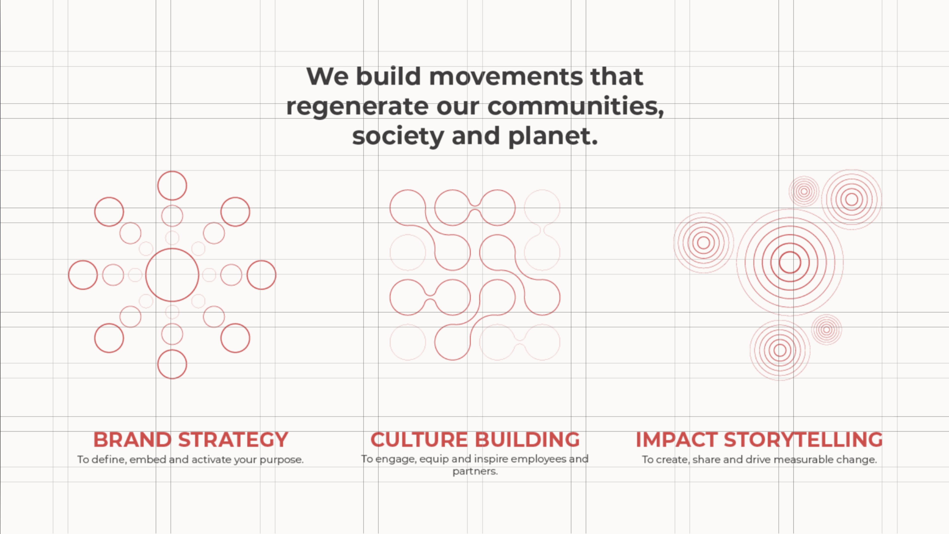
We First’s logo is rooted in circles; a shape that represents what the consultancy stands for. Growth. Wholeness. Evolution. We built the identity to harken back to this symbol, and rippled it out across all brand touch-points, from the website to social media to B2B tools.
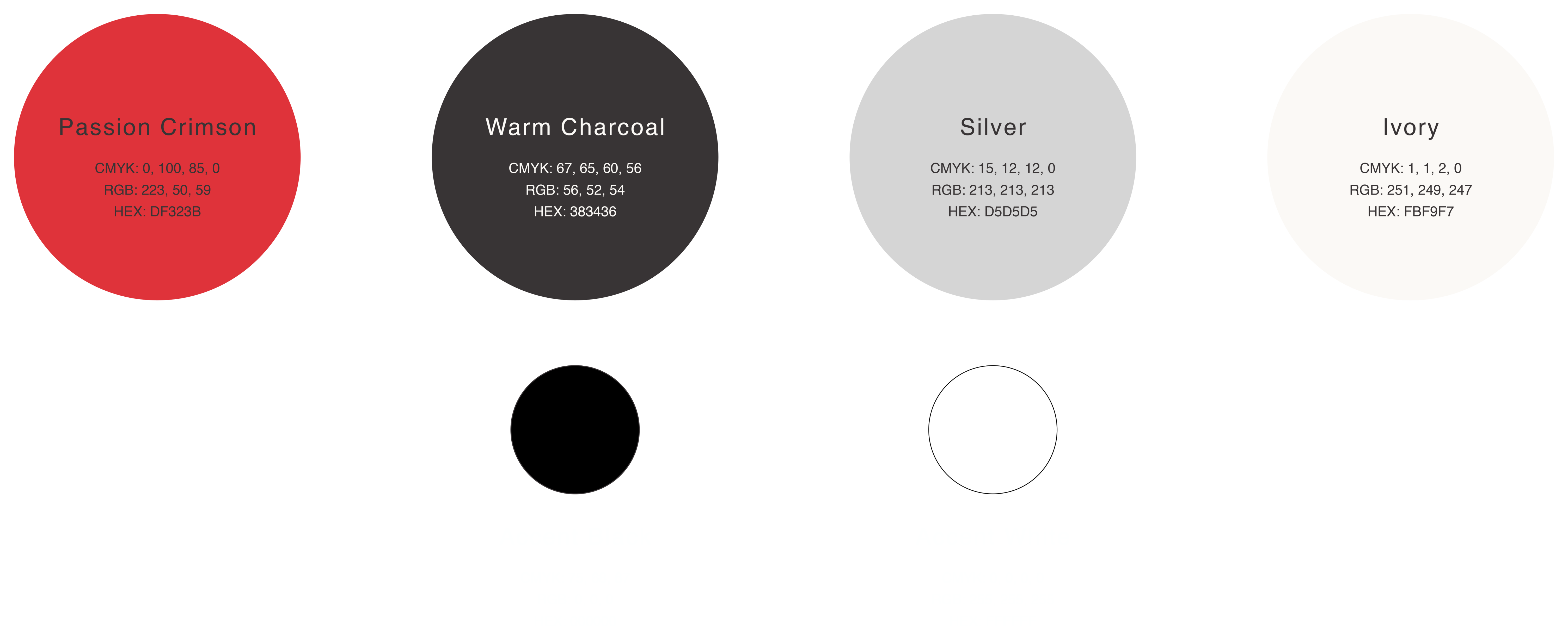
COLOR PALETTE
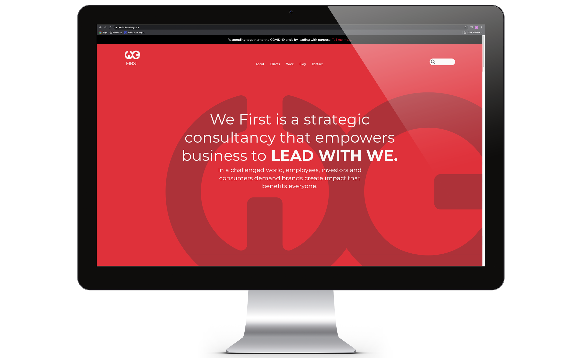
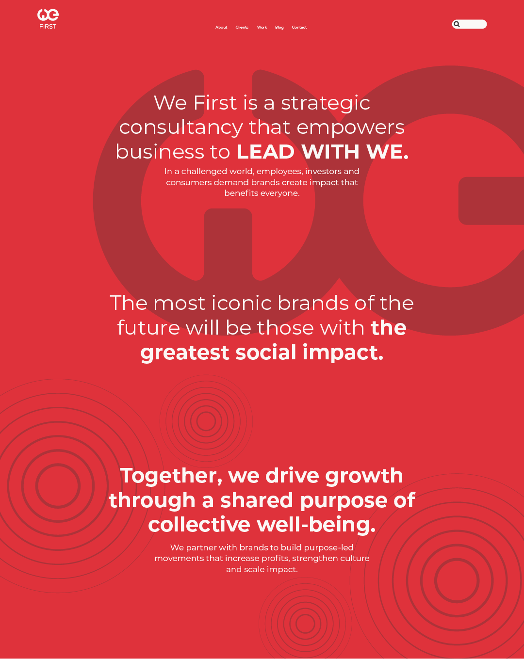
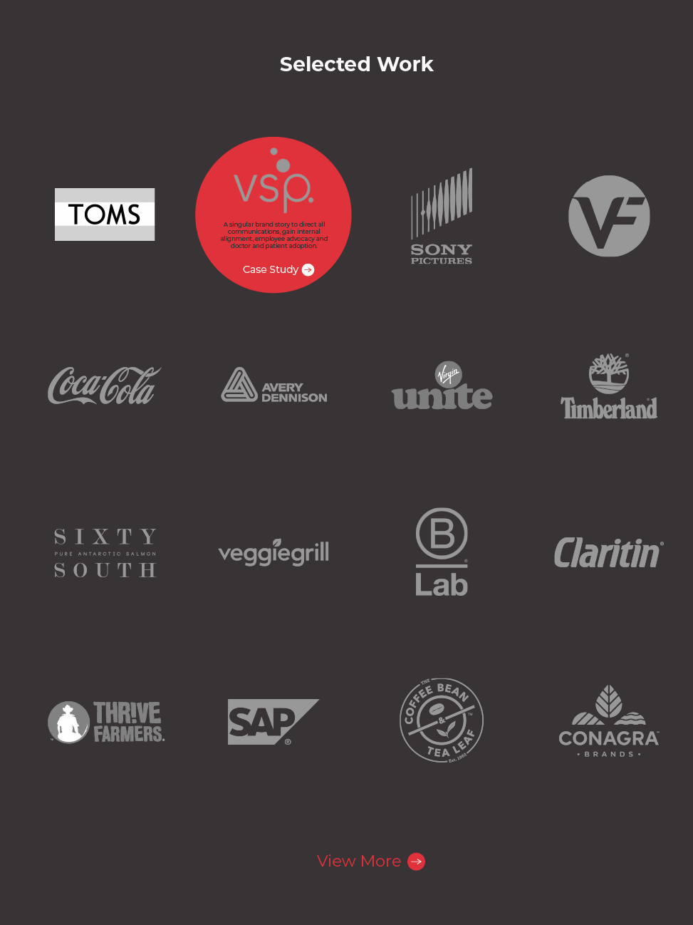
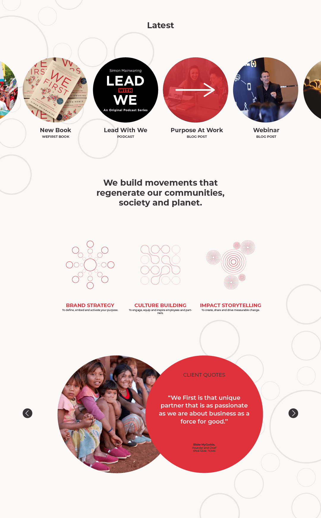
WEBSITE
PRINT MATERIALS
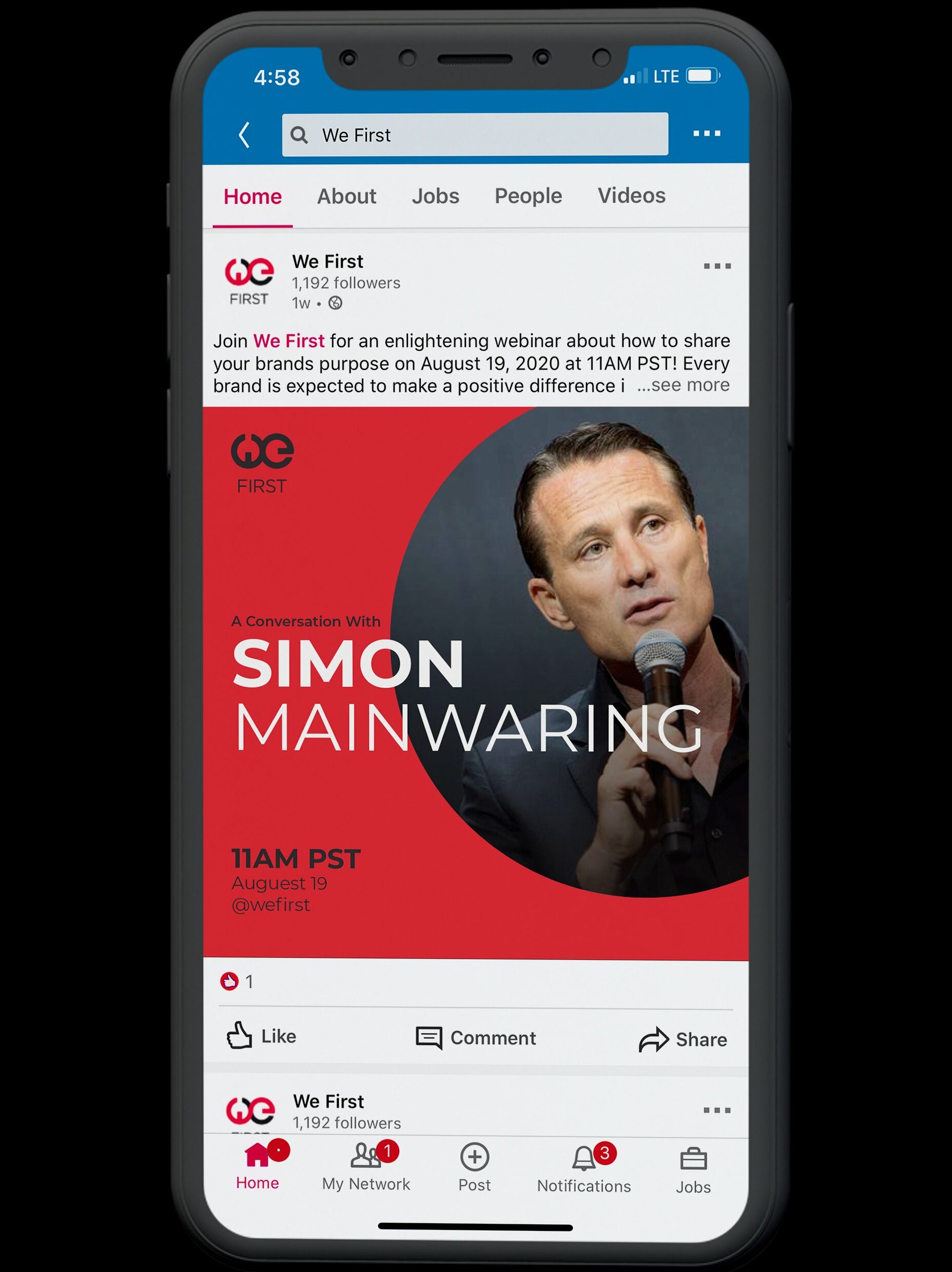
SOCIAL MEDIA
ICONOGRAPHY
A Visual Shorthand
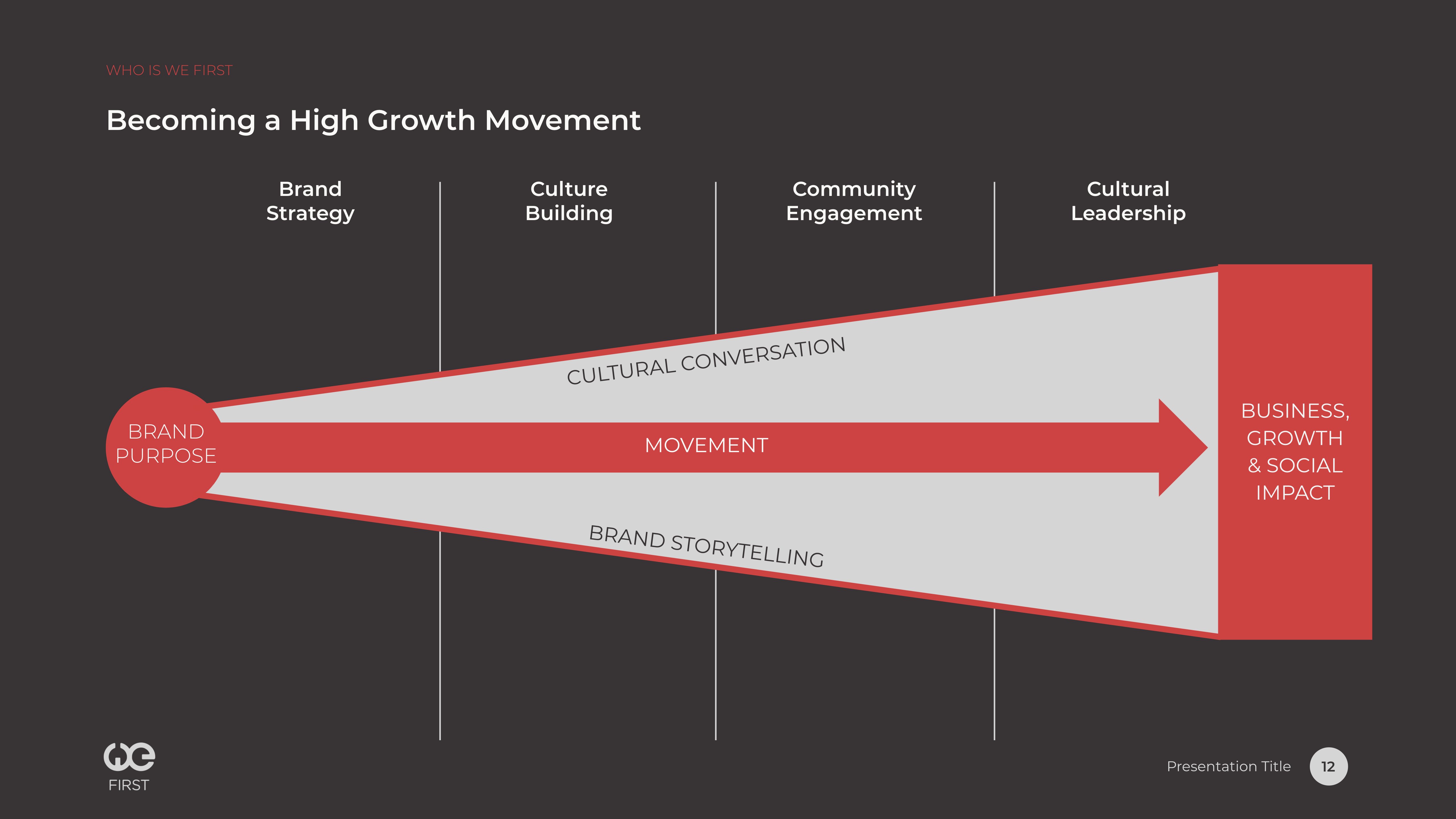
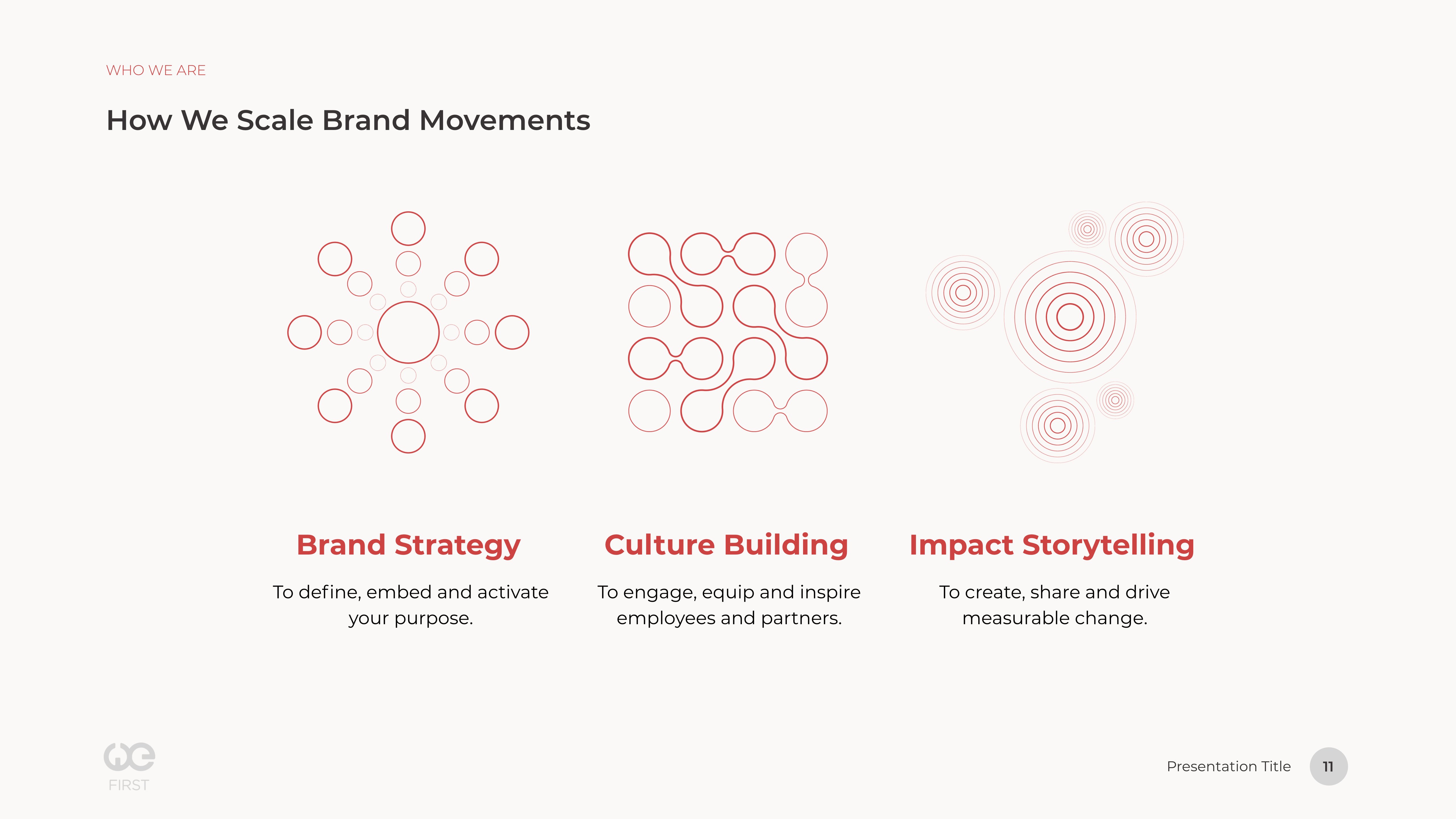
To visualize what the consultancy specializes in, we developed an iconography system again rooted in a circular visual language. These tools offer We First a dynamic way to express the capabilities of the company.
CULTURE
SYSTEM
STRATEGY
IMPACT
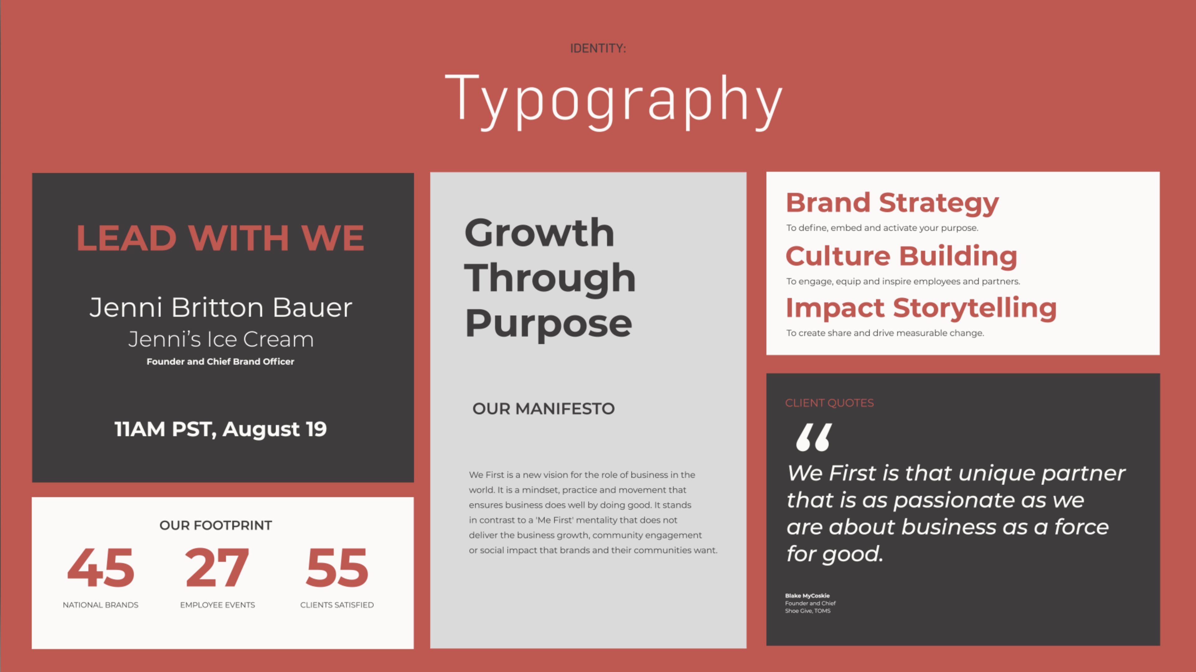
Dynamic Grid System
Identities can be tough to keep consistent. So, we delivered a dynamic grid system that allowed We First to quickly and easily update website pages, sales decks, and business collateral. Just stay inside the lines and let the system do the rest.