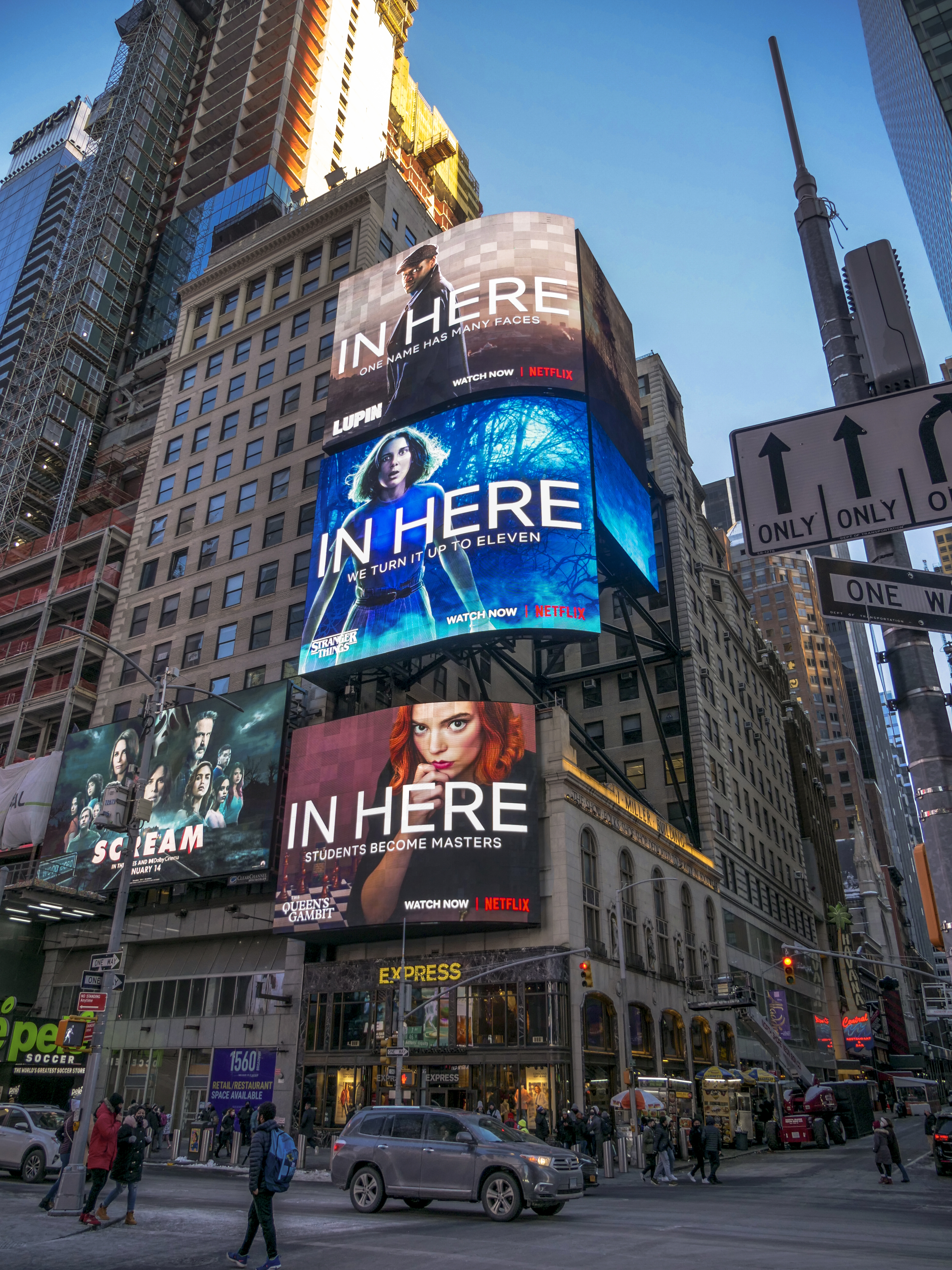
Paramount+ – Star Trek Brand Identity
DIFFERENT ERAS, DISTINCT IDENTITIES
For seven decades, Star Trek has entertained and inspired audiences around the world. But there have never been identity guidelines for each show or film; as such, Star Trek has boldly explored a spectrum of design eras. From Deep Space Nine to The Next Generation, Picard to Voyager, there has been a wide spectrum of Star Trek logos, lockups, fonts, and sizes throughout the franchise’s 55-year history.
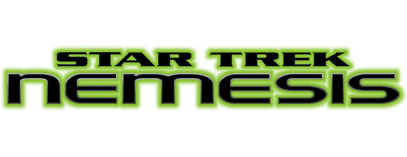
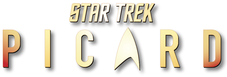


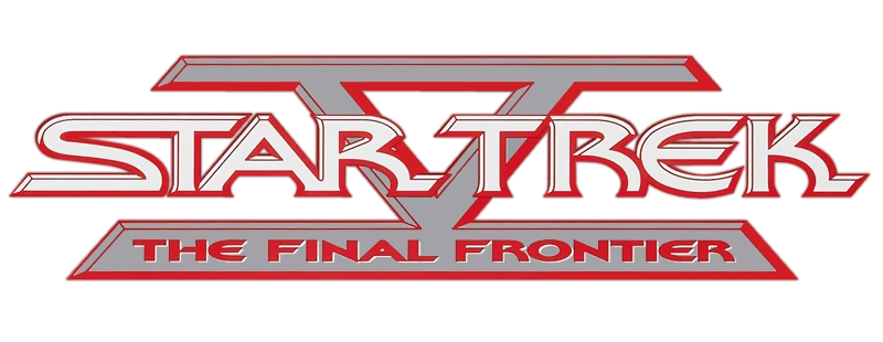


UNITING A UNIVERSE
Consistency: The Final Frontier. We set out to build a system that could unify all Star Trek properties, while still holding onto the core elements that make the design of each show or film unique.
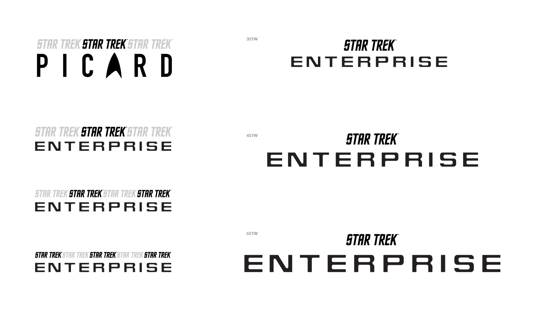
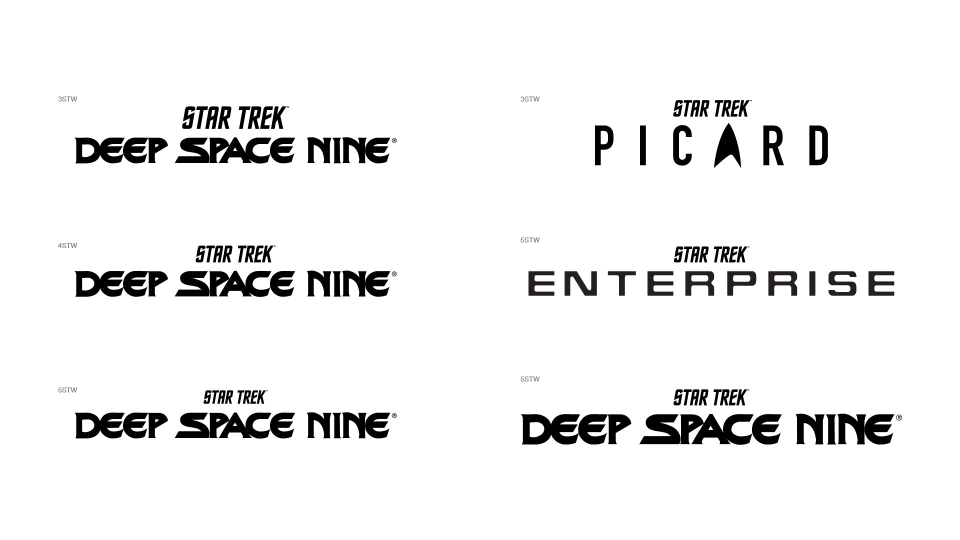
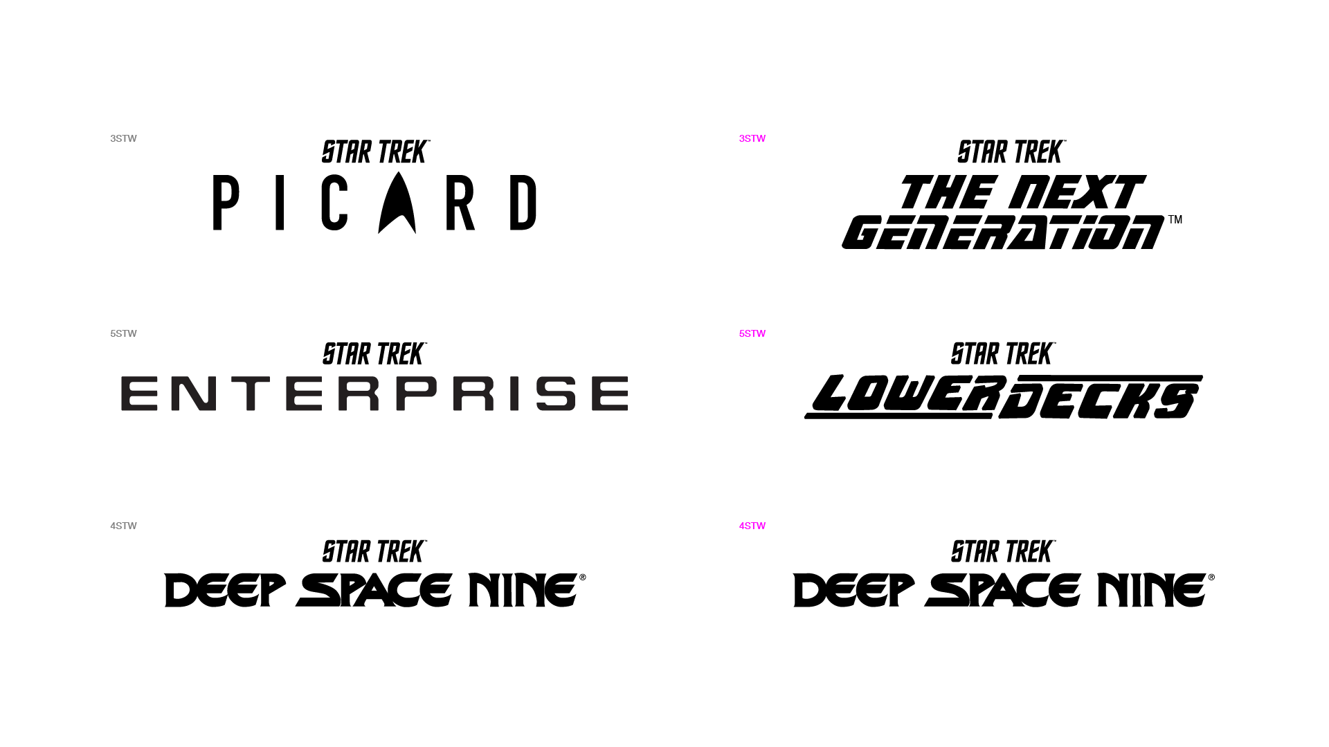
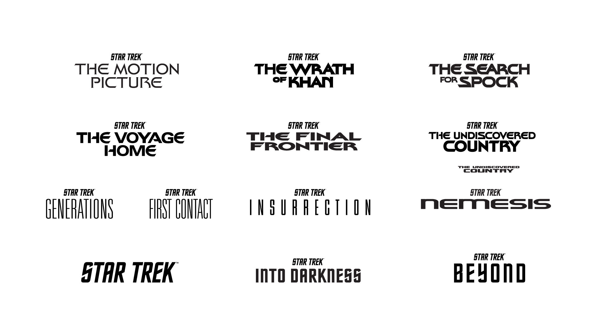
THE GOAL OF THE EXPLORATION WAS TO ANSWER QUESTIONS LIKE:
WHICH STAR TREK FONT IS THE MOST ICONIC AND RECOGNIZABLE TO FANS?
WHAT'S THE INFORMATION HIERARCHY BETWEEN STAR TREK AND A SHOW FILM TITLE?
HOW CAN WE BUILD A SYSTEM THAT WORKS JUST AS WELL ON A SOCIAL ICON AS IT DOES ON A BILLBOARD?
RETROACTIVE UPDATES, FUTURE-FACING GUIDELINES
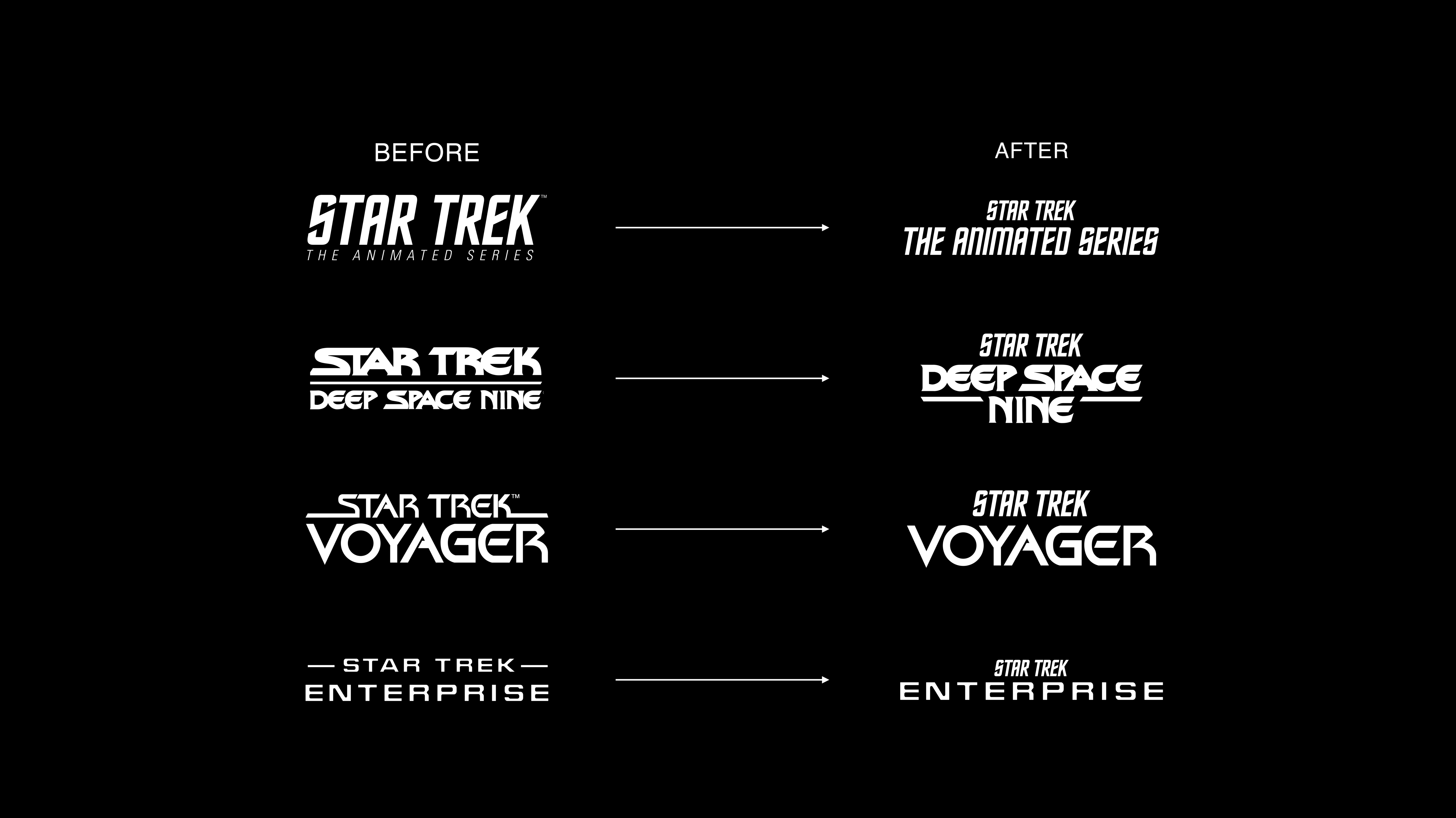
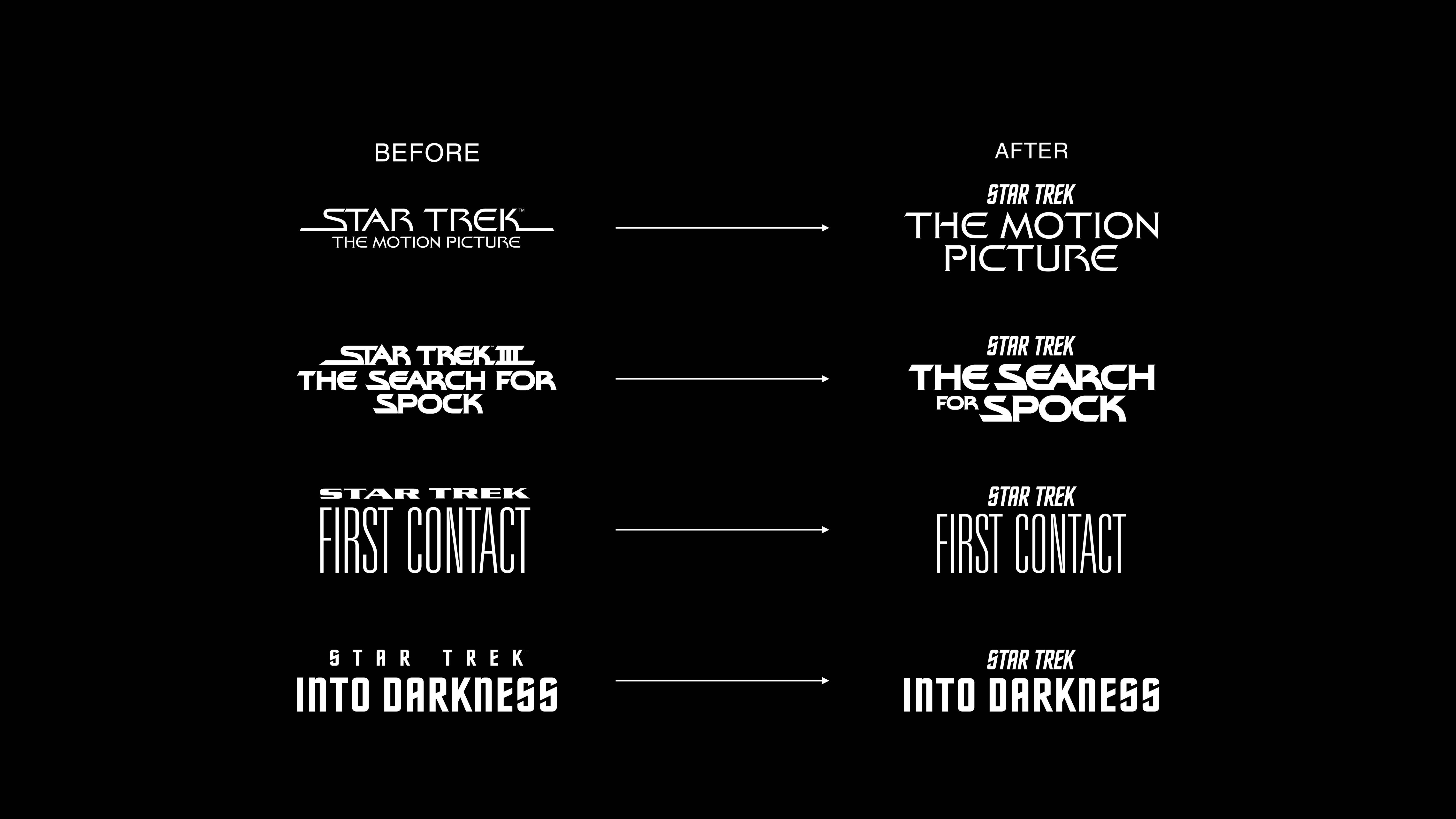
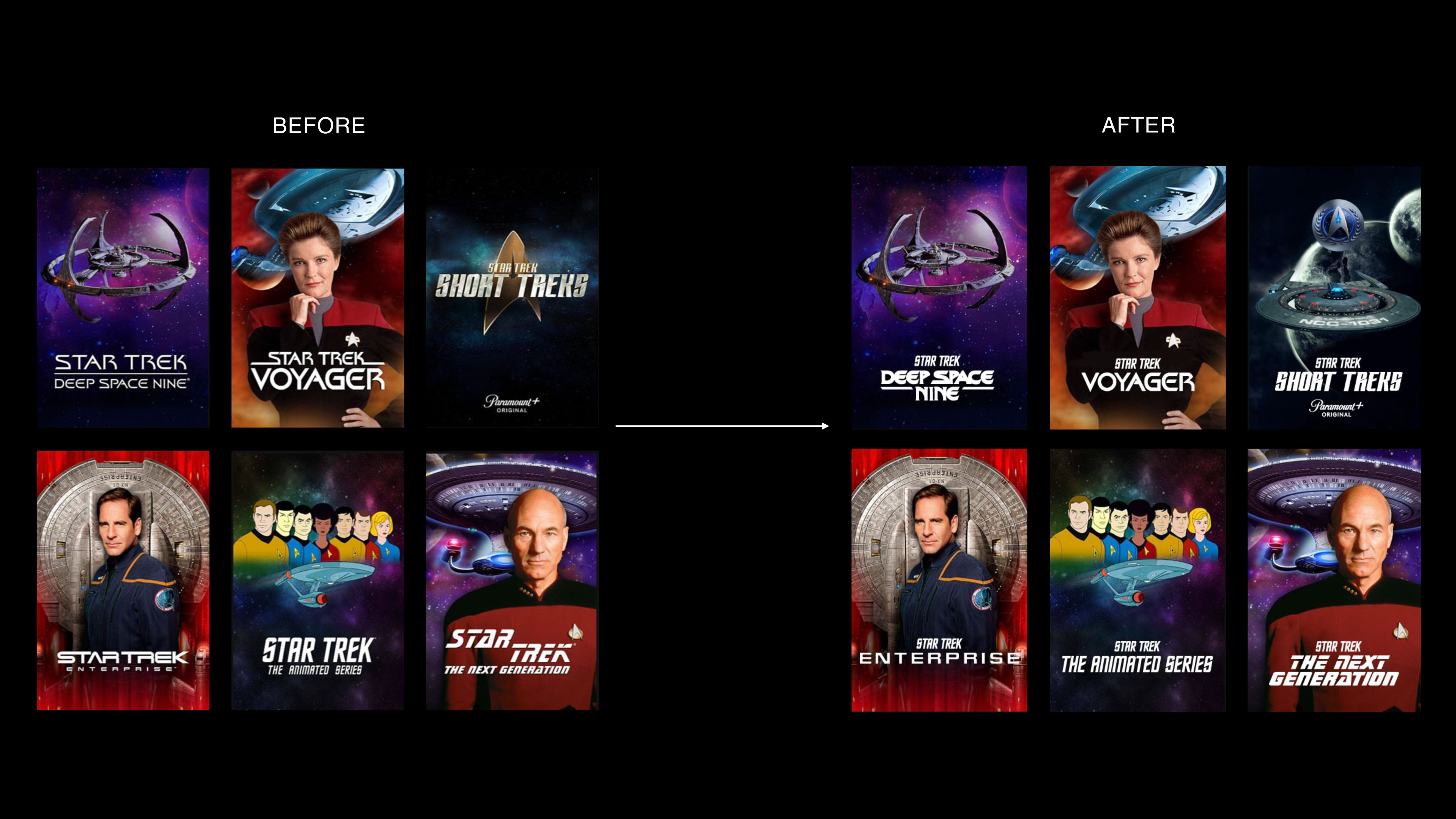
The new Star Trek identity system is anchored by the logo from Star Trek: The Original Series. Each logo now features the iconic Star Trek mark center-aligned above the show- or filmspecific title; scaling guidelines were also developed to ensure the information hierarchy remains consistent across all properties — past, present, and future.

SHOWS
FILMS
UI
SOCIAL MEDIA
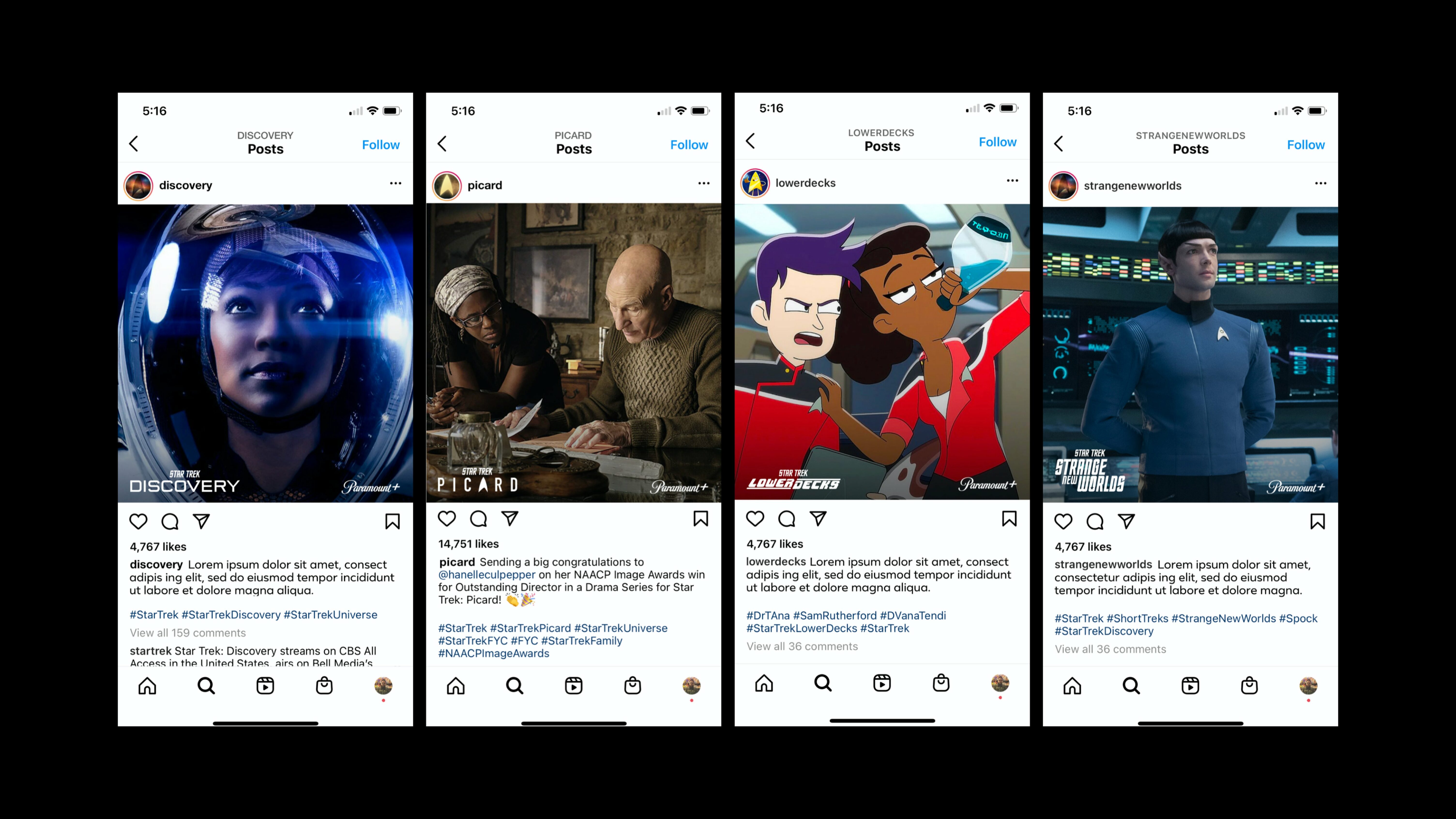
TEMPLATES
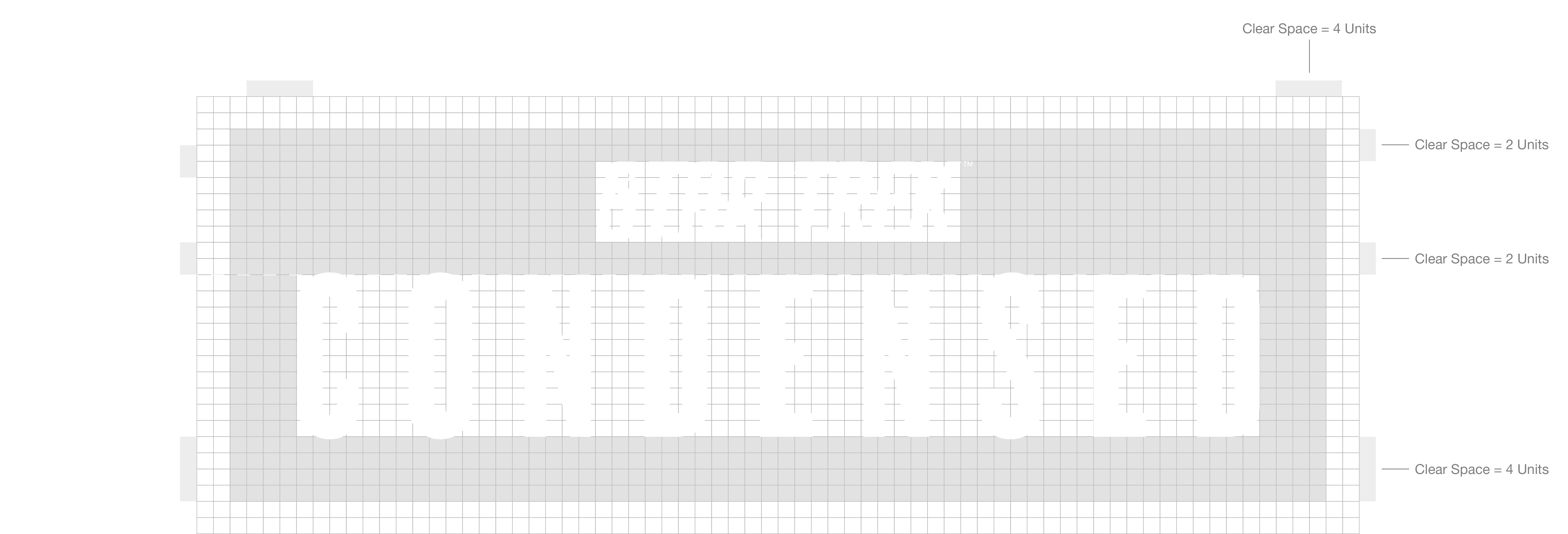

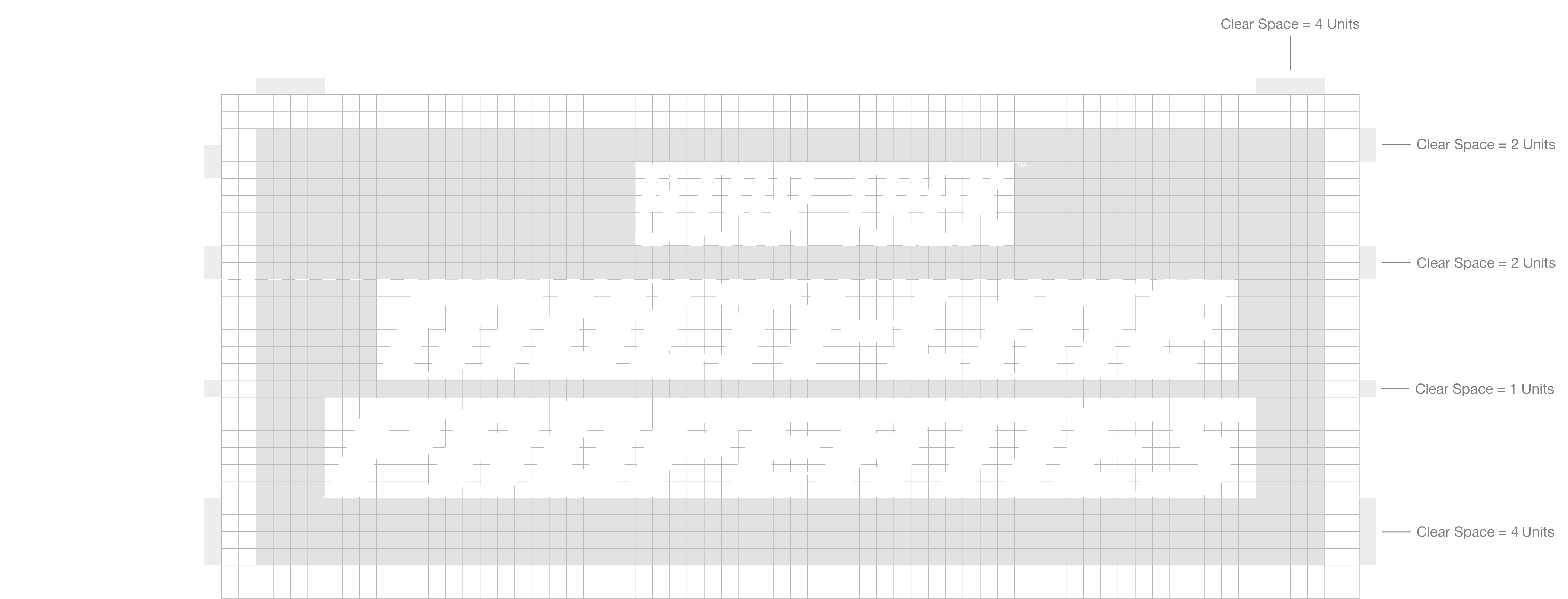


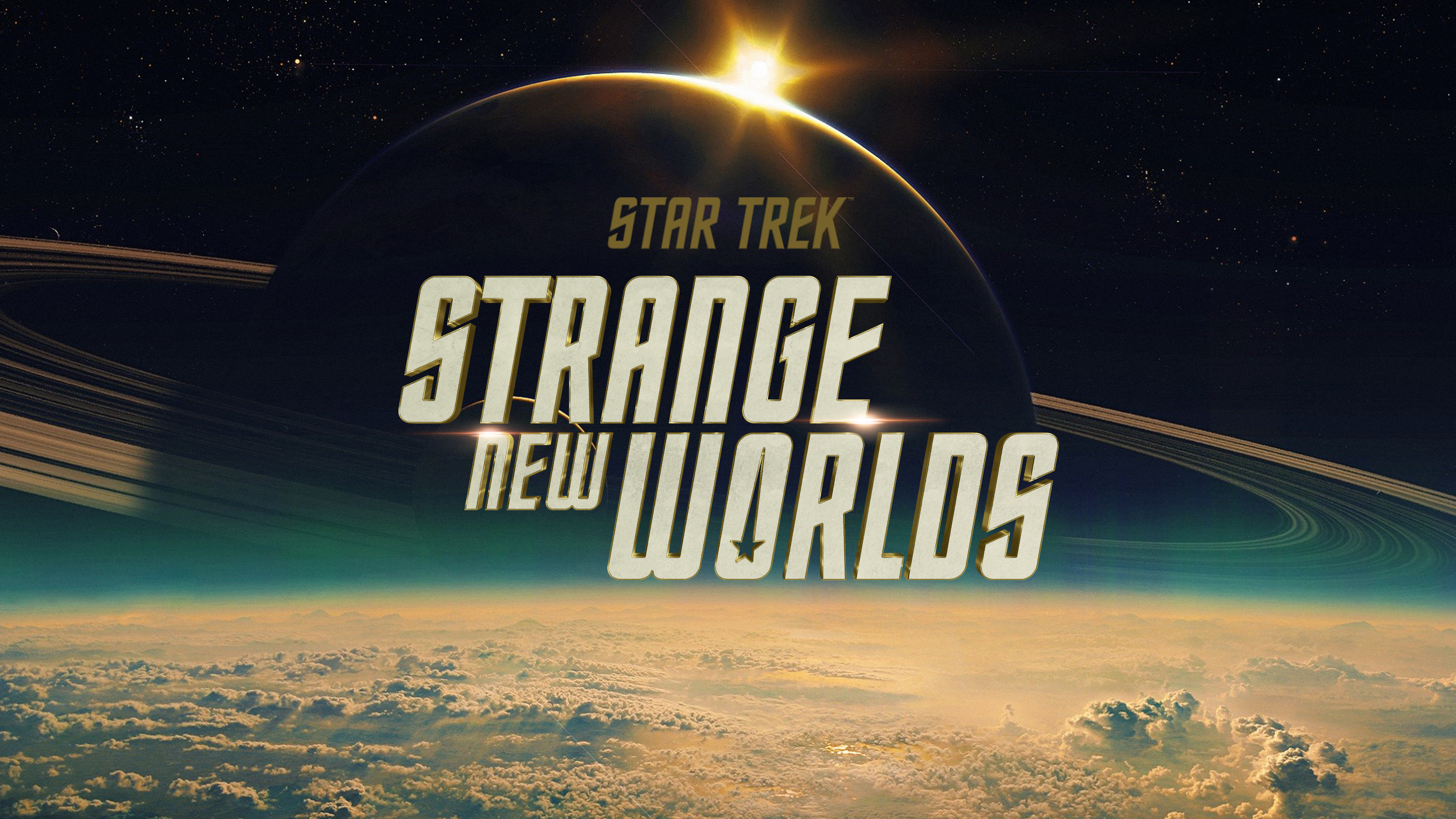
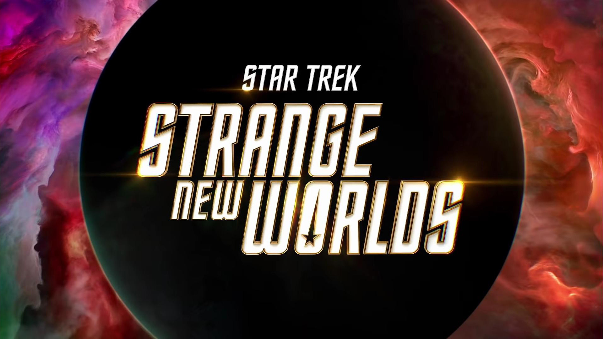
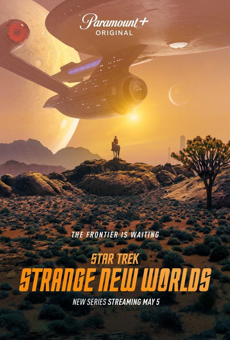
INTRODUCING STRANGE NEW WORLDS
We developed the identity for Paramount+’s highly-anticipated original series, Star Trek: Strange New Worlds, giving it an ownable look & feel, while ensuring the identity adheres to the new brand guidelines.

Stay in touch with your compadres
